Whitney-Anne Ideh.
Film: "A Nightmare on Elm Street"
Release Date: 27th April 2010 (USA) 7th May 2010 (UK).
Director: Samuel Bayer.
Film Info: The 2010 movie is actually a remake of the 1984 version, written and directed by Wes Craven.
Synopsis: Death stalks the dreams of several young adults to claim its revenge on the killing of Freddy Kruger. Chased and chastised by this finger-bladed demon, it is the awakening of old memories and the denials of a past of retribution that spurns this hellish vision of a dreamlike state and turns death into a nightmare reality.
Production/Financing Companies: New Line Cinema (presents) Platinum Dunes.
Distributor: New Line Cinema, Sandrew Metronome Distribution, Warner Bros. Entertainment.
Principle Cast: Jackie Earle Haley – Freddy Krueger
Kyle Gallne – Quentin Smith
Rooney Mara – Nancy Holbrook
Katie Cassidy – Kris Fowles
Thomas Dekker – Jesse Braun
Kellan Lutz – Dean Russell
Sub-Genre: I believe the sub-genre would be Thriller and Slasher.
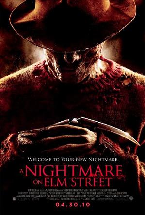
Denotation: The background is dark and looks like the wall is made of rusty metal. The main image is in a mid-shot, which gives us a better and clearer perception of Freddy Krueger, who is actually the main image. We can also see Freddy’s iconic weapon (blades on fingers) which could relate to the title also ‘Nightmare’ meaning he is going to hunt people in their dreams, so already we are slightly aware of what might happen in the movie, his smile also connotes that he is happy about hunting people’s dreams and being their worst nightmare.
The masthead ‘A Nightmare on Elm Street’ doesn’t make it seem as though everyone is having different types of nightmares. The use of ‘A’ really emphasises that Freddy is the fear that terrorises the people living in Elm Street.
Mise-en-scene:
Lighting – Not much lighting is used, which is a good thing as ‘nightmares’ are usually dark and gloomy. Lighting is used a little bit to enhance certain aspects of Freddy, such as the burn scars that he has all over his face, which in itself creates a mask, which is quite popular in the slasher sub-genre. Also the lighting enhances the burn holes on this clothes. It is interesting how he has burn holes all over his jumper but not on his hat. Lastly the lighting also enhances Freddy’s weapon, making it more eye catching, so those who probably watched the original already know what movie it is by looking at the weapon.
NVC – The NVC used in this poster is probably the most interesting part of the poster as the main character is in a mid-shot, this allows to see the terror in his face.
Reading the plot summary I have a brief idea of the movie. The burn marks on his face show the past of Freddy Krueger – getting burnt alive – It’s interesting because in a dream world you’d assume people can actually control what goes on in their dreams, however in this movie Freddy Krueger keeps his burn marks to insinuate fear and also as his victims are not free to control what actually takes place in their dreams makes it a nightmare. On Freddy’s face we can see a smile of pleasure and happiness, this connotes that he enjoys killing people, he enjoys seeing people suffer and the look on their faces when they are suffering. Freddy’s body posture almost give this “I’m waiting” or “I’m ready” impression, as though he patiently waiting for his victims to fall asleep so he can welcome them with fear and death.
Camera: The Main Image is in a mid-shot/Close-up.
Typography: The typography used is connotes a more serious tone to the poster. Having ‘Nightmare’ the biggest writing on the poster really emphasises the term and really gets you to think about nightmares.
Colour: The colour used are used to compliment both the main image and the Masthead. Lots of reds and blacks are used to connote that nightmares are very gruesome and dark – particularly this one. Some whites are used to enhance the dark colours even more.
Masthead: The masthead is regular, not bold, so that the main attention is the poster not any thing else.
Tagline: The tagline reinforces the masthead, but giving it a new meaning. “Welcome” really supports Freddy Krueger’s body expression as the way his arms are position it’s almost as if he is saying “Welcome” using his NVC. “New Nightmare” suggest that this is a different type of nightmare, one that has never been seen by anyone, which is actually in the movie, as people that get cut in their dreams are actually cut in real life and people die in unexpected ways.
Film: "A Nightmare on Elm Street"
Release Date: 27th April 2010 (USA) 7th May 2010 (UK).
Director: Samuel Bayer.
Film Info: The 2010 movie is actually a remake of the 1984 version, written and directed by Wes Craven.
Synopsis: Death stalks the dreams of several young adults to claim its revenge on the killing of Freddy Kruger. Chased and chastised by this finger-bladed demon, it is the awakening of old memories and the denials of a past of retribution that spurns this hellish vision of a dreamlike state and turns death into a nightmare reality.
Production/Financing Companies: New Line Cinema (presents) Platinum Dunes.
Distributor: New Line Cinema, Sandrew Metronome Distribution, Warner Bros. Entertainment.
Principle Cast: Jackie Earle Haley – Freddy Krueger
Kyle Gallne – Quentin Smith
Rooney Mara – Nancy Holbrook
Katie Cassidy – Kris Fowles
Thomas Dekker – Jesse Braun
Kellan Lutz – Dean Russell
Sub-Genre: I believe the sub-genre would be Thriller and Slasher.
Denotation: The background is dark and looks like the wall is made of rusty metal. The main image is in a mid-shot, which gives us a better and clearer perception of Freddy Krueger, who is actually the main image. We can also see Freddy’s iconic weapon (blades on fingers) which could relate to the title also ‘Nightmare’ meaning he is going to hunt people in their dreams, so already we are slightly aware of what might happen in the movie, his smile also connotes that he is happy about hunting people’s dreams and being their worst nightmare.
The masthead ‘A Nightmare on Elm Street’ doesn’t make it seem as though everyone is having different types of nightmares. The use of ‘A’ really emphasises that Freddy is the fear that terrorises the people living in Elm Street.
Mise-en-scene:
Lighting – Not much lighting is used, which is a good thing as ‘nightmares’ are usually dark and gloomy. Lighting is used a little bit to enhance certain aspects of Freddy, such as the burn scars that he has all over his face, which in itself creates a mask, which is quite popular in the slasher sub-genre. Also the lighting enhances the burn holes on this clothes. It is interesting how he has burn holes all over his jumper but not on his hat. Lastly the lighting also enhances Freddy’s weapon, making it more eye catching, so those who probably watched the original already know what movie it is by looking at the weapon.
NVC – The NVC used in this poster is probably the most interesting part of the poster as the main character is in a mid-shot, this allows to see the terror in his face.
Reading the plot summary I have a brief idea of the movie. The burn marks on his face show the past of Freddy Krueger – getting burnt alive – It’s interesting because in a dream world you’d assume people can actually control what goes on in their dreams, however in this movie Freddy Krueger keeps his burn marks to insinuate fear and also as his victims are not free to control what actually takes place in their dreams makes it a nightmare. On Freddy’s face we can see a smile of pleasure and happiness, this connotes that he enjoys killing people, he enjoys seeing people suffer and the look on their faces when they are suffering. Freddy’s body posture almost give this “I’m waiting” or “I’m ready” impression, as though he patiently waiting for his victims to fall asleep so he can welcome them with fear and death.
Camera: The Main Image is in a mid-shot/Close-up.
Typography: The typography used is connotes a more serious tone to the poster. Having ‘Nightmare’ the biggest writing on the poster really emphasises the term and really gets you to think about nightmares.
Colour: The colour used are used to compliment both the main image and the Masthead. Lots of reds and blacks are used to connote that nightmares are very gruesome and dark – particularly this one. Some whites are used to enhance the dark colours even more.
Masthead: The masthead is regular, not bold, so that the main attention is the poster not any thing else.
Tagline: The tagline reinforces the masthead, but giving it a new meaning. “Welcome” really supports Freddy Krueger’s body expression as the way his arms are position it’s almost as if he is saying “Welcome” using his NVC. “New Nightmare” suggest that this is a different type of nightmare, one that has never been seen by anyone, which is actually in the movie, as people that get cut in their dreams are actually cut in real life and people die in unexpected ways.

Credits: The release date is small, but the credits are even smaller, this is so that the audience are only drawn to the main image only, not even the masthead as this is not as bold, so attention is only placed on Freddy Krueger.
Jacob Fritze.
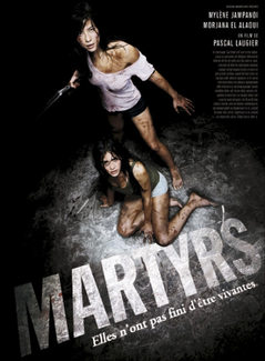
Film: "Matyrs"
Release Date: 3.09.2008
Director: Pascal Laugier
Film info: It’s classified as a new type of Horror in France. Also Laugier has confirmed in an interview that he is currently in the middle of negotiating the rights for Martyrs to be remade in America, which probably will be released in 2014
Production/ Financing Companies: Eskwad, Wild Bunch, TCB Films
Principle Cast: Erika Scott, Morjana Alaoui, Jessie Pham
Synopsis: A young woman's quest for revenge against the people who kidnapped and tormented her as a child leads her and a friend, who is also a victim of child abuse, on a terrifying journey into a living hell of depravity.
Mise-en Scene: The scene is set in a dark, greyish looking environment and focuses on two women who are placed in the centre of the poster. One of them is standing on her feet, whereas the other one is sitting on the ground as well as both of them are facing the camera directly (direct address). Furthermore both are wearing quite short clothes and no shoes, which is giving the audience an insight that the film might contain violent scenes towards women and connotes sexuality. For NVC, it can be said that the facial expression for the woman who is standing connote strengths and anger, as her mouth is slightly open and she bows her head down a bit. However the woman who is sitting on the floor looks more scared than the one who is standing, which gives the impression as if the standing one is protecting the sitting one. The floor looks grey and scratched as if heavy objects were moved over it. This could tell the audience that the scene is most likely set in a basement or cellar.
Camera: Both subjects are shot out of a high angle which makes both women looking up to face the camera directly. This represents them as inferior out of the perspective the audience takes. Furthermore both are shown as long shots, which gives the viewer more information’s about surroundings and setting of the place they are in. The way how the whole poster represents the women is that the audience takes the view of probably a male figure or a person that is controlling both of them. The camera angle also represents them as sexually vulnerable.
Colour: The colour scheme of the poster are dark greyish looking colours as well as a black background that fades into white and grey towards the centre of the poster. Both women are wearing dark and white clothes in contrast, which kind of represents them as innocent.
Typography: The film tile (“Matyrs”) appears on the floor where the two women are sitting on in capital letters. Also the font of the writing is clear written and easy for every person of any age group to read. Due to the fact that the title appears on the floor it seems as if the title is literally part of the floor.
Mood & Styling: The styling and makeup of the actors connotes that they got chased and tortured throughout the film due to their dirty clothes and the dirt on their skin. The mood of the poster is quite in tense, as the woman who is standing is holding some sort of weapon in her right hand and looks as if she’d be ready to fight someone in the next moment.
Specific Conventions: Below the title, there is a selling line, which reads “Elles n’ont pas fini d’etre vivantes” which is French and means “She did not live to be finished”. Furthermore the word martyr, meaning witness, was used in the secular sphere as well as in the New Testament of the Bible. In the top right hand corner appears the name of the Director, Starring and by whom it is written.
Fadeke Faluyi.
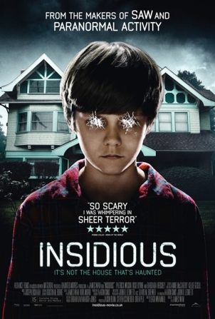
Film title: "Insidious."
Release date: September 14, 2010
Director: James Wan
Produced by: James Blum, Oren Peli and Steven Schneider
Principle Cast:
·Patrick Wilson as Josh Lambert
·Josh Feldman as Young Josh
·Rose Byrne as Renai Lambert
·Ty Simpkins as Dalton Lambert
·Andrew Astor as Foster Lambert
·Barbara Hershey as Lorraine Lambert
·Lin Shaye as Elise Rainier
Films origin: first part of a currently two part sequel
Synopsis: the film is based on a child that is followed by a red faced figure in his dreams as he, Dalton, falls into a “coma” after falling off a ladder in the attic. To his parents despair, father Josh and Mother Renai, supernatural events occur in the beautiful old house they recently moved into, including voices on a walkie-talkie and physical figures appearing in rooms that disappear. As they think it is the house that is causing the problems, they soon decide to move, to which other events, such as doors closing by themselves, a little child running around and rocking horses moving by themselves, continue occurring. Out of terror and fear, they call an old woman who is able to communicate with supernatural figures, where she discovers a red faced figure… the figure causing Dalton to be in a coma for so long. It is made clear, that it is Dalton that carries the demon, due to fear, he has left his body and is too far away to return and wake up. Due to this, demons and the dead surround his physical body to take it over and inflict pain on the living. As the sinister events continue, an end had to be put under control, when the father is sent into Daltons dreams to pull out the evil spirits force and bring him back into the real world. This causes a traumatic ending, where the father, Josh, becomes possessed.
Conventions: The Insidious movie poster consists of a symmetrical image, a tagline, quotes, credits and film title. The poster follows the conventions of a supernatural horror due to its use of a normal young male, with his eyes scratched out. This connotes to the audience that he is either the protagonist or antagonist. However, it is clear he is the central character. The fact it is stated on the poster that it is ‘From the makers of Saw and Paranormal Activity’- films that have proven to be successful, gives Insidious an immediate reputation for audiences to actually watch the film. The high key lighting in the mid shot image is used to enable the audience to see the NVC of the child, with his facial expression serious, looking straight into the camera with his eyes scratched out connotes something could happen to the boy in the film.
His shoulders are relaxed, almost as if he is asleep or without control of his body, connoting the purpose of his role as well as the story line that he “isn’t in a coma but they don’t know what it is.” Furthermore with the image showing the setting of the film in the background, being dark, old and creepy is a common location for psychological/ supernatural horror films to occur in.
Mood: The mood portrayed in the movie poster is fearful and creepy. The fact that his eyes are scratched out connotes that the child could be possessed, which is disturbing to some people; therefore indicates the movie to be scary which is why many people enjoy the horror genre. The dark house in the background and scary young boy conveys a sense of super natural occurrence and a mood that creates an uncomfortable feeling towards the audience.
Font/Names: Insidious’ title is very simple, accompanied by the tagline that is in colour. The font is close to Sans Serif fonts, however due to the bright white colour against the dark background, it becomes distinctive and bold enough to see from a distance. The use of white connotes and supports the idea of ghosts, supernatural beings to convey the supernatural horror- as well as the correlation of white on the scratches on the eyes and other texts on the poster.
Credits: The names of the actors are small, connoting that it isn’t the actors or actresses they’re trying to sell in the film, but something other than that such as the story line. This movie poster does not reveal too much about the film, indicating this is a teaser poster as to make the audience curious and made aware that the film is soon to be released making it mysterious and intriguing. In addition, encouraging audiences to look out for further releases to find out when the film is put in cinemas.
Colour: The fonts used for the film title is white, as are the rest of the texts. With a contrasting dark background, it enables the text to be bold in order to be seen clearly. Furthermore, the white text connotes the connection between the colour white and ghosts, supernatural beings which offers to the audience the common indication of what the sub-genre is. The choice of white is consistent throughout the movie poster around the boy, as well as the scratches on his eyes being white; connoting that it is him who has the biggest connection to the supernatural being/relates most to it. The choice of red for his costume indicates death, blood and danger; common within the horror genre.
Tagline: The tagline “IT’S NOT THE HOUSE THAT’S HAUNTED” suggests that in correlation to the image of the young boy standing in front of the house, that he is the one that is in fact ‘HAUNTED’, giving the audience a fear that such an ordinary boy must be supernatural for the film to be rated and praised as “So scary I was whimpering in sheer terror” indicating the film does what a horror is supposed to; hence appealing to an audience that enjoys the thrill of horror. The tagline stresses evil, horror and supernatural beings such as ghosts or demons; hence the adjective “haunted”.
Quotes: “So scary I was whimpering in sheer terror” alongside a five star rating is given to praise the film, and to emphasise the level of fear inflicted on previous viewers, therefore sharing the excitement of thrill and terror to other audiences in order to appeal to their target market; people who enjoy really grim, evil and scary horror.
Eugene Neil.
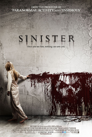
Film title: "Sinister."
Release date: 12th October 2012
Director: Scott: Derrickson
Sub Genre: Horror, mystery, thriller
Film info: Writer C. Robert Cargill says that his inspiration for the movie came from a nightmare he experienced after seeing The Ring, in which he discovered a film in his attic depicting the hanging of an entire family.
There is a sequel said to be coming out in 2015, the story is somewhat the same i.e. another family moves into the house
Principle cast:
Ethan Hawke - Ellison Oswalt
Juliet Rylance - Tracy
James Ransone - Deputy
Fred Dalton Thompson- Sheriff
Synopsis: A true-crime writer finds a cache of 8mm home movies films that suggest the murder he is currently researching is the work of a serial killer whose career dates back to the 1960s.
Conventions: This poster has various different conventions, this includes an image masthead, tagline and the film title. The conventions used seem to be the common conventions of horror this is because there is usually someone innocent on the cover (girl) and there will also be something sinister just like the figure in this. The fact that the girl seems to be making this image or figure connotes evil and it makes the audience think that there might be something more to this girl. The fact that she is looking down and her posture seems as though she is asleep connotes that she might not be in control of her actions, in fact it could be this figure that is controlling her. Also the fact that she is wearing her pyjamas is provocative as it again connotes that she is not in control of her actions because she may be in a trance of asleep.
Colour & Lighting: The poster I have chosen is the sinister poster, the colours used are a mixture of light and dark colours. The dark red used for the face makes it stand out, the fact that red was used connotes evil or something sinister. The fact that the girl is mostly dressed in white again shows that she is pure as white connotes a pure spirit, as I said it again gives the audience the feeling that she is not in control of her action and it is in fact this figure that is making her do things that she is not wanting to do. The lighting seems dark in the corners and it seems to get lighter as it moves into the middle of the poster I believe that this was done deliberately to make the face stand out, this in turn gives the audience a sinister feeling, this also links into the film title, I believe that this was also done to show that whatever this is it has brought a dark outlook and this girl life i.e. Turing what was once light into darkness.
NVC: The NVC seems to be quite sinister and provocative. As I said before the fact that the girl seems to be the one drawing the face makes the audience think if there is more to the girl then that meets your eye. The setting of the poster seems to be an old house or an attic, this itself gives the audience a creepy feeling, and I believe that the setting was quite simple but it does still create a sense of tension. The fact that it is set in an old attic/house gives the audience a very creepy feeling, also the fact the corners of the wall seem to be peeling of paint again suggests that this is an old house with dark secrets.
Camera: The shot used is a long shot, this is used to show the whole setting and also to show the girl within the poster. I believe that this shot was used to create a sense of tension, this is because you are able to see both subjects in the photo, it also enables the audience to see how close this "thing" is to the girl. This shot is also very provocative as it makes the audience feel a sense of tension as it enables them to see the danger that the girl faces alone.
Costume: The costume that the girl is wearing is again simple, it seems to be pyjamas as I said above, this although simple is again provocative as it makes you think that this demon has followed the girl to her house i.e. when she is asleep. It also has a feeling of innocence to it and it makes the audience feel sympathy for the subject in the poster. The fact that she is in her pyjamas again connotes danger, because as I said it seems to the subject isn't even same in her own home.
Font: There seems to be one font type used within this poster, the colours of the font are red and white, the title (SINISTER) seems to have a shadow below each letter creating a sense of tension. This again was done intentionally as it connotes an old haunted feeling
Tagline: The tagline is “once you see him, nothing can save you”. This isn't very big on the poster but it is again though provoking. This suggests that the girl in the picture is the one who has seen him i.e. this is why he is so close to her in the poster. It also leaves the audience wondering whether the girl has actually seen the figure or not because on the poster she seems to be looking away this connotes that she has not seen him yet.
Mood: The mood that the poster sets is tense again quite tense and sinister, I believe that the poster alone makes the audience wants to see the movie and it makes them think about the plot. Also the fact that there are various aspects left undiscovered such as the question of if the girl has seen it or not. The conventions on the poster are common conventions of the horror genre and because of this audiences will want to see this film.
