In what way does your media production use, develop or challenge forms & conventions of real media products?
Question 1, this consists of looking at general horror
conventions, and this is just basically conventions that help the audience
recognise the genre of the film/trailer. Our trailer is a horror splatter film,
this consists of films such as hostel, wolf creek etc. During this stage we
will see if we in fact followed general convections of the horror genre and the
splatter genre.
Conventions:
As I said above conventions are things that enable the audience to identify themselves or the film with a particular genre of film, for example a common horror conventions is weapons and blood and if we look at the common conventions of a magazine we will see that there are various different things such as the selling line, barcode etc.
Poster:
When we were creating our final poster we tried to follow the general conventions of a horror poster, we knew if we did follow these conventions our poster would in turn look more like a horror poster and hopefully our poster would then resemble of professional poster. By looking at existing horror poster we were able to get an idea of different horror poster, this also enables us to make sure that we were able to develop our poster into something good. We took inspirations from different posters and this helped us to make our poster, we used these conventions into out poster and developed these to suit our trailer.
|
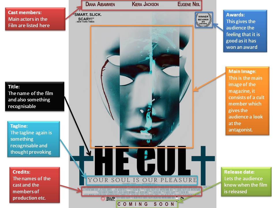
Poster Mise-en scene:
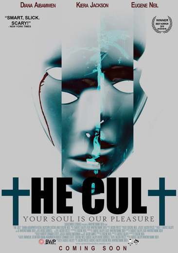
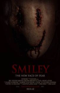
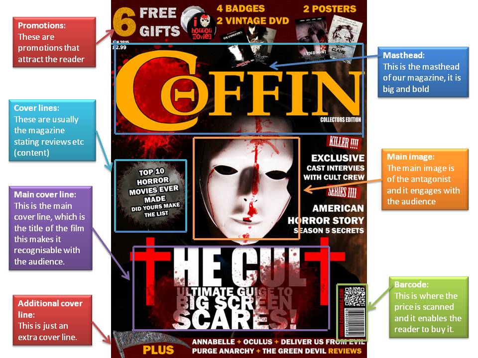
Conventions: This poster has various different conventions, this includes an image masthead, tagline and the film title. The conventions used seem to be the common conventions of horror this is because there is usually a mask that can be identified with the film, this can be considered as iconic i.e. some masks in the horror film are iconic e.g. Friday the 13th mask and Halloween Mike Myers mask. The poster is quite simple but we believed that it would be effective as the mask is the main thing that can be identified with the film, also the fact that the mask is cur makes the audience think. The other conventions that we followed were the text i.e. using a symbol to replace a letter, in this case two crosses replace T, the connotes something religious and this relates to the name ‘the cult’. The again is a common convention of the horror genre as it is usually something religious, furthermore the blood is one more convention that was followed, this also leaves the audience the a sinister feeling. Colour & Lighting: The colours used in this poster and mostly dark and sinister colours. Regarding the lighting firstly, the image was taken at a |
low key lighting however the image was posturized, as you can see in the poster above. The fact that the image was
posturized gives is quite unique as this is not something that is common on a horror poster,
however this gives the image another dimension and it leaves the audience thinking. Also the fact that everything is a blue and black colour shows that there was a colour scheme followed, the fact that the blood is the only thing another colour again is a good and interesting aspect as it signifies that blood if the dominant aspect of the film.
NVC:
The NVC seems to be quite sinister and provocative, as I said before the mask creates a very tense and eerie feeling. The fact that the mask seems to be split up connotes that there is danger and there seems to be more than one person it furthermore shows that everything is not what it seems it somewhat gives the audience the feeling of hallucination i.e. the cult makes you see things that is why you are seeing a mask that looks like it is seen in double vision. We decided to follow a simple convention like posters such as silence of the lambs, the eye etc.
|
|
|
|
|
|
|
|
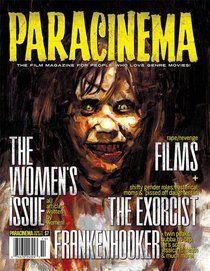
Another aspect that we looked at was the fact there were also various different posters that we could follow, this could be the conventions of the poster of just the layout and the colour scheme of the poster. We decided to incorporate these aspects and conventions into our trailer as you can see from the analysis above there were various different conventions that were followed as you can see below there are some posters that did inspire our own poster. Although not all of the poster below are of the slasher genre they are still captivating to the audience and because of this we chose to follow some conventions from these particular posters.
As you can see some aspects are similar and also some colour schemes, as I said above our poster is simple but effective and this resembles some of the posters below.
As you can see some aspects are similar and also some colour schemes, as I said above our poster is simple but effective and this resembles some of the posters below.
Film title: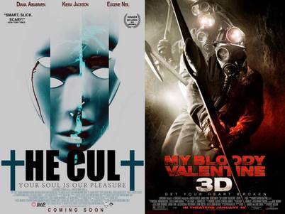
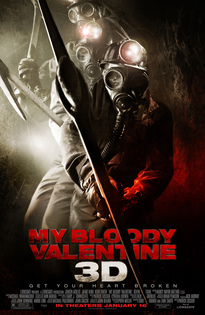
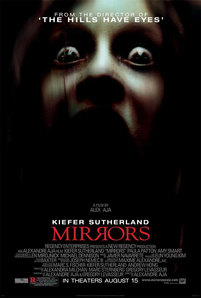
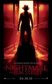
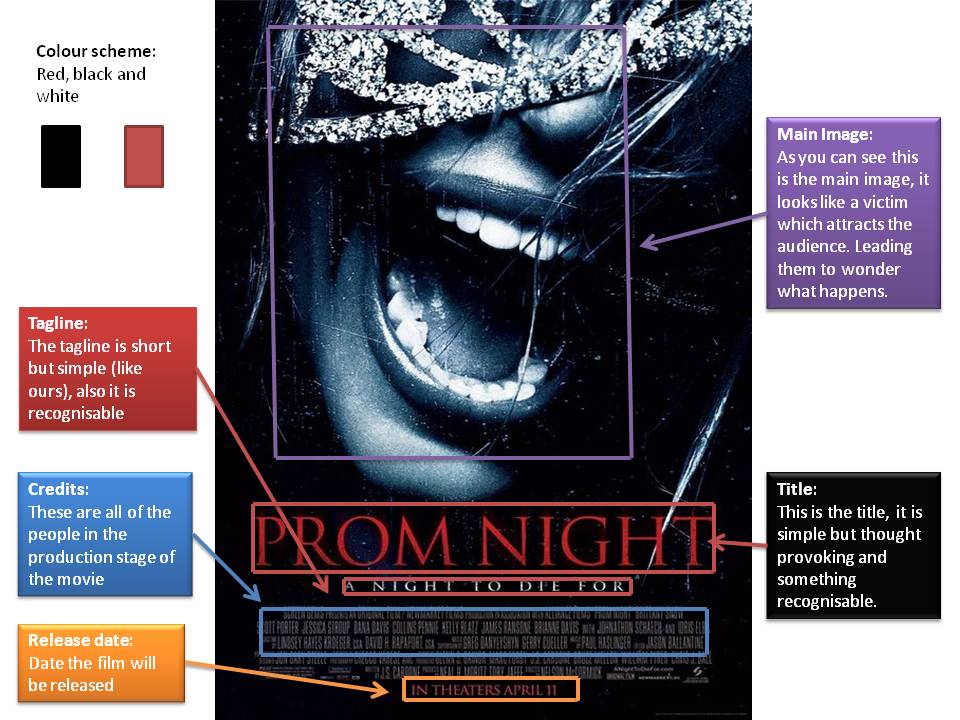
As you can see just like the bloody valentine poster we decided to put the film title in the centre of the poster, we decided that this would be very effective as we would be able to attract the audience’s attention to the title of the film. This is similar to the my bloody valentine poster and also various different posters of the horror genre, the font used is simple in the two poster but it is also bold which again attracts the audience to the title which in turn wants to make them know more about this film. The other example is mirrors although the title is not as bold as our there is a play on the letters, as you can see one R is the wrong way around, this is also done be us as we replaced the T with crosses, this again makes the audience thing and wonder if the film has something to do with religion (like most horror movies).
Tagline: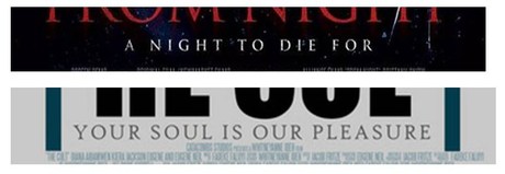
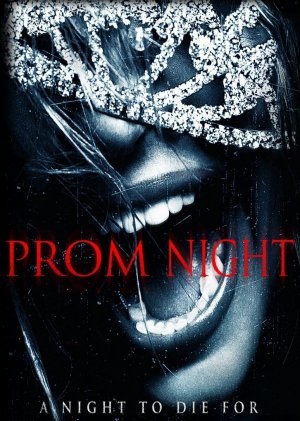
In this comparison you are able to see that that the tagline is placed in a similar position, ( just under the title), it was decided that this would be effective as the bold title attracts the attention and the tagline is the next thing that is seen so it again leaves the audience thinking and wondering. As you can see the prom night poster has done a similar thing with their layout as it is placed in the same position. The tagline for this poster is ‘a night to die for’ and ours is ‘your soul is our pleasure’, as it can be seen the taglines are both short and effective, this again is a convention/aspect that we liked i.e. not the make the tagline to long but in fact to make it effective and provocative.
The tagline is important for the whole movie as a whole as some taglines have become so identifiable and recognisable that you instantly know the movie just by seeing the tagline. As I said our is very provoking and it seems to follow the conventions of any normal tagline on a horror poster. |
Antagonist on cover: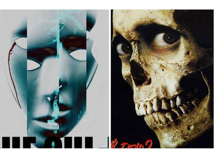
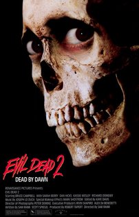
As you are able to see both our poster and the evil dead poster decided to put the antagonist of the front as the main image, furthermore it is the only thing in the image which in turn attracts the audience to the image as they are not distracted by anything else within the image. Furthermore as you can see when looking at both of the posters the image used is a close up of the antagonists face, this again creates tension and it leaves the audience thinking and wondering what is this character capable of. As I mentioned before both posters are simple but it is effective as it is intriguing as captivating. Wed decided to follow this convention of using the antagonist as the main image as it enables the audience to have something to recognise e.g. Friday the 13th or in fact evil dead can be recognised just by the character/antagonist. The fact that the shot is a close up enables the audience to see details, like the evil dead poster we wanted the antagonist to be seen in detail.
Colour scheme: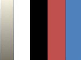
The colour scheme that we used for our poster was white, grey, black, red and blue (light and dark). We decided to keep this as a consistent colour through our stages i.e. the title in the final trailer also followed similar colours as you will see later. Most of these colours used are the ones usually found in a horror poster such as red which connotes danger and evil and black which again connotes something dark and mysterious. Having said this the blue (light and dark) is not a usual colour but we decided that it is unique and something different from the plain boring colours, also the fact that the image is pasteurized does give the background this colour but we decided we liked this and went on to use in it in the title and also in the trailer title.
|
Release date: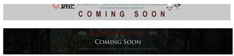
Our poster decided to put a coming soon on the front to signify that the movie will be released soon, as it is just a teaser there is no set date for the release date. We also decided that it looks more professional as it is a convention of a poster.
This followed general conventions but usually there is a date, the fact that we only put coming soon, this could be a challenge to the general conventions. The coming soon is in red, it is not too bold but the colour makes the audience see this and it lets them know that/when the movie will be released |
Credits: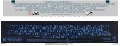
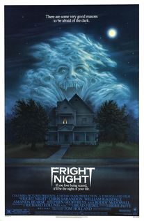
We decided to put the credits at the bottom of the poster, this is because again this is a common convention/layout typically seen in posters, it also makes it look more professional and gives it a developed touch. As you are able to see in the fright night poster, the fonts are similar to the ones we used in our poster i.e. the font is a similar colour, also the font is not too bold so does not attract the attention of the Audience. Both are a significantly long but it does not affect it because it is said it is not bold and overpowering, we decided to make it like this as it is a common convention.
|
Conventions Diagrams of Posters:
The cult poster:
Prom night poster:
Overall I believe that we followed various different conventions to create the poster. We decided that following conventions was an important thing as we wanted to create a professional look/poster. The attention to detail when creating the poster was good as it gave us a poster of a professional standard, furthermore the conventions that inspired us helped us to create a poster that we wanted to achieve, each convention followed and adapted/incorporated enabled us to create this poster.
Magazine:
Similar to the poster stage of our production we again found various different inspiration through horror magazines, we looked at various different magazines such as fangoria, scream etc. We decided to take tips and conventions from existing magazines and incorporate them into a final product of our own.
|
Magazine mise-en-scene:
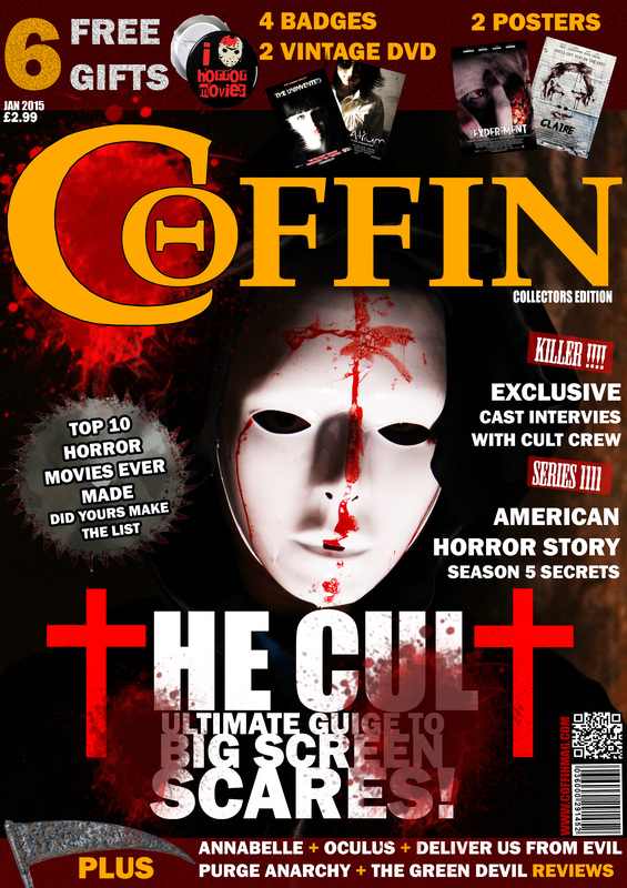
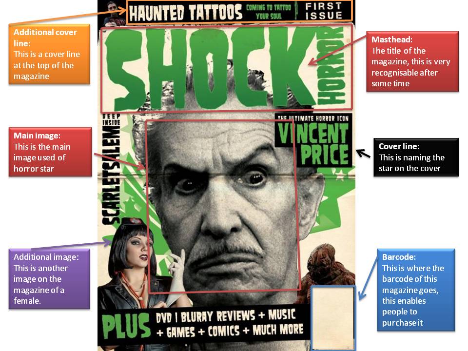
Colour: The colours used for our magazine are consistent, there are made up of red, yellow, white and black, the fact that four colours are used is unusual as this is quite a lot but we believed that the magazine would still signify horror and evil. Regarding the colours they are ones that are usually related to the horror genre, red was used as it connotes evil danger and blood, black connotes dark, mystery and the yellow and white although not common horror colours they blend into the magazine creating an eye catching front cover with a bold colour used for the masthead. Lighting: The lighting used for the main image seems to be used effectively as you are able to see the lighting on the mask but having said this the rest of the image is dark, this is done intentionally as the objective was to draw attention to the mask which is the most important thing of the image and the background was then darker to expose the colours of the magazine. Also the fact that the background is dark could connote danger as said before. Font: There seems to be three different fonts used in this magazine, each has colours incorporated into them to make each font stand out. The Masthead had the only main different font in the |
magazine, this was done intentionally to draw attention from the audience also the colour used is very bold. The rest of the font seems to be plain e.g. for the cover lines, this again is done intentionally as it is not over the top but it enables the audience to see the cover lines after they have look at the bold masthead.
Camera:
The shot used for this image is a mid-shot; this enables you to see the antagonist chest upwards. This shot is simple but effective as it does not reveal too much but just enough for the audience to be excited as they can see the costume.
Masthead:
The masthead reads ‘Coffin’, this is a simple title but is signifies horror as any coffin would. As stated above the masthead is very bold, it attracts the attention of the audience to the magazine. The colour used for the masthead is yellow, this is unusual when it comes to horror but it has been used effectively as it suits the magazine. The o in the c is also a good touch as it is just an effect for the audience to savour.
Cover lines:
There are 5 different cover lines in this particular magazine; we decided that we did not want to overcrowd the magazine as it would look unprofessional. The magazine has achieved a professional look throughout; the cover lines attract the audience to the magazine as well as the use of the rectangle in the background work well at getting the attention of the audience. One cover line reads ‘cast interview’, this again is a common convention and a good touch as it makes the audience want to read more about the film on the cover itself.
Mood: The mood created by coffin magazine is one of tension and anticipation, firstly the main image leaves the audience thinking and wondering if this is the only antagonist i.e. it leaves various unanswered questions. The colours connote evil and this signifies horror. Overall the magazine does create a eerie feeling within the audience.
|
|
|
|
|
|
|
|
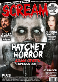
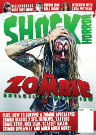
The above shows the number of magazines that inspired our own magazine, as you can see each magazine has their own convention and we followed and developed these conventions and we then made our magazine and it did somewhat have a professional look.
Masthead: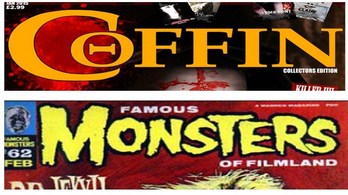
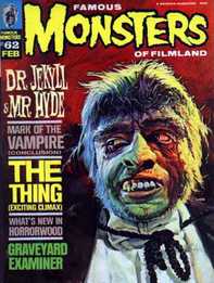
The masthead was a very important aspect of our magazine, we wanted the masthead to be big abd bold and we wanted it to stand out on the front cover. We decided that this was important as it would attract the audience’s attention to it and it could then make it iconic and recognisable. The colour used was also bright again attracting the attention the audience/readers, it is not a common colour used in horror magazine but we saw it in the magazine shown above (monster), as you can see they used the same colour and it seemed o work effectively inspired by this magazine we decided to make our masthead similar.
Cover lines: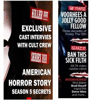
The cover lines were also another important aspect of our magazine as we wanted to make it so that although not being to bold we still wanted it to stand out. There were some magazines that were followed such as the one above as you can see the use of an image o be a background of a cover line (saw) was something that we liked so we incorporated it into our magazine. Also we decided not to use to many cover lines as this was a convention of the horror magazine i.e. it focuses more on the main image and masthead.
The cover lines state various different things such as the content of the magazine and what to find, this entices the audience to read more. |
Bottom cover lines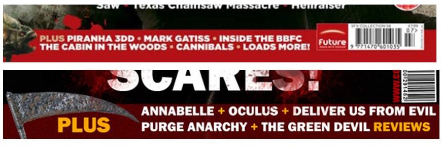
In addition to the common cover lines found at the side of the magazine we wanted to another one at the bottom, this is seen in many horror magazines so we wanted to incorporate it into our very own magazine. As you can see both our magazine and he magazine pictured both show new releases of horror film we decided this was a good aspect to place into our magazine as it gives the audience the feeling that it is a mainstream magazine that reviews mainstream films. Also reviews are commonly seen in film magazines so we wanted to include it in our as it would be more professional and eye catching for the audience.
Main cover line: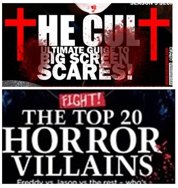
Another important convention that we wanted to follow was the fact that we wanted the main cover line of the title to stand out, this is because we wanted to make sure that the audience was able to identify our movie to be the main thing within this magazine. To achieve this we looked at various different magazines to see how they utilised their main cover line. There were many inspirations but the one shown above was a big inspiration regarding the colour, placement (middle) and also the way the text size is in ascending order i.e. from small to big. As i said we wanted the text to stand out and we wanted to give it a professional look and feel.
Antagonist on the cover: |
Barcode: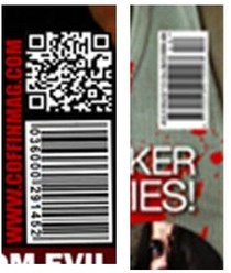
The barcode is a simple but important convention of the horror magazine, it is one aspect that we did not want to leave out and we wanted to make sure that it was a convenient size. What we did not want was to make it too big and bold so that it distracted the audience from the main things on the magazine. It is simply something that enables the audience to purchase the magazine again reinstating the fact that it is simple but important aspect. All magazines have a barcode so we did not need to really look for inspiration regarding that but we liked the way the barcode is positioned in the magazine in the image above so we incorporated it into our magazine and positioned it the same way
|
The convention/aspect of placing the antagonist on the front cover was one that we wanted to follow as we decided that it enables the audience to get a glimpse of the antagonist and it could also make the antagonist recognisable like characters such as Mike Myers etc. Furthermore placing the antagonist on the cover is a common convention of horror magazines, because of this we wanted to follow this convention to make our magazine professional. Just like the image shown the use of lighting is good, we did this to make the image stand out.
Also having the antagonist on the front cover does follow the conventions of most horror magazines, having said this it could be a challenge as we don't if it is the antagonist. |
Magazine Covention diagrams:
The cult- Coffin Magazine:
Shock Magazine:
By looking at our magazine we can say that it does look one of a professional standard, this is because we decided to follow different conventions to make sure that it matched the common conventions of a horror magazine. There were different aspects that we incorporated from magazines into our own final magazine.
Trailer:
When and before creating our trailer we watched various different trailers just to get a sense of the pacing and the general shots within a horror trailer. By doing this we could see the general conventions within horror trailers, we were inspired more by some trailer than others but each and every trailer we watched helped us incorporate the knowledge into the making of our own trailer.
|
|
|
The cult trailer:
The above is our trailer, as you can see there were conventions that were challenged and also developed to make this trailer. The fact that is a teaser trailer is the reason why it is not very long, it is 45 seconds long and this is the normal time for a teaser trailer. Within the trailer the antagonist is seen along with the protagonist, also weapons and gore is shown just to fit in with our sub genre which is splatter.
The above is our trailer, as you can see there were conventions that were challenged and also developed to make this trailer. The fact that is a teaser trailer is the reason why it is not very long, it is 45 seconds long and this is the normal time for a teaser trailer. Within the trailer the antagonist is seen along with the protagonist, also weapons and gore is shown just to fit in with our sub genre which is splatter.
Evil dead trailer:
This trailer is the evil dead trailer; we decided to follow this trailer, as it was similar to the pace we wanted to use in our trailer. After this was decided we followed the number of shots and the pace of shots, this is because we knew that the evil dead trailer looked professional so we wanted to follow the conventions that they used, but we also wanted to develop and challenge these conventions so we could make our own unique and professional trailer.
This trailer is the evil dead trailer; we decided to follow this trailer, as it was similar to the pace we wanted to use in our trailer. After this was decided we followed the number of shots and the pace of shots, this is because we knew that the evil dead trailer looked professional so we wanted to follow the conventions that they used, but we also wanted to develop and challenge these conventions so we could make our own unique and professional trailer.
Captions: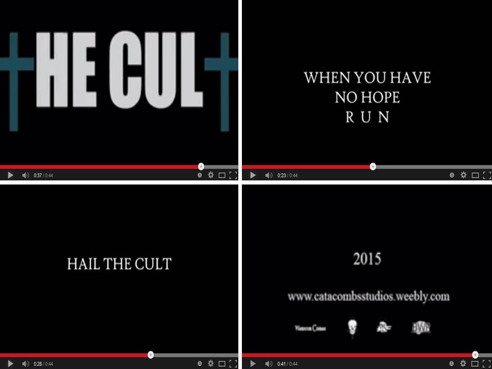
When making our magazine we looked at various different trailers as I said before, we also looked at the amount of captions that usually appear in a horror trailer. During our research we found that the captions depend on the trailer i.e. if the captions are telling a story then there will be more captions however if the captions are brief then there wont be too many captions. As said above the trailer that we looked at most was the evil dead trailer, because of this we decided to use the same number of captions that they used, this is because the number of shots/layout was based on this trailer so because of this we decided to stick to this as it fitted in with our trailer. Our captions just build tension again like the evil dead captions; we decided not to add to many captions as sometimes it distracts the audience from the real meaning of the trailer, we also decided to use our website as one of the captions this is because we wanted to make it look more professional, also the fact that we included the release date also makes the trailer look more professional.
Weapons and gore: |
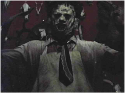
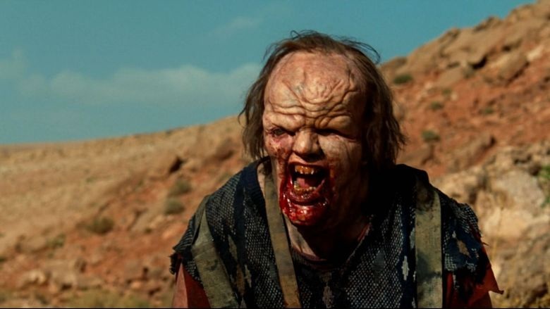
Antagonist: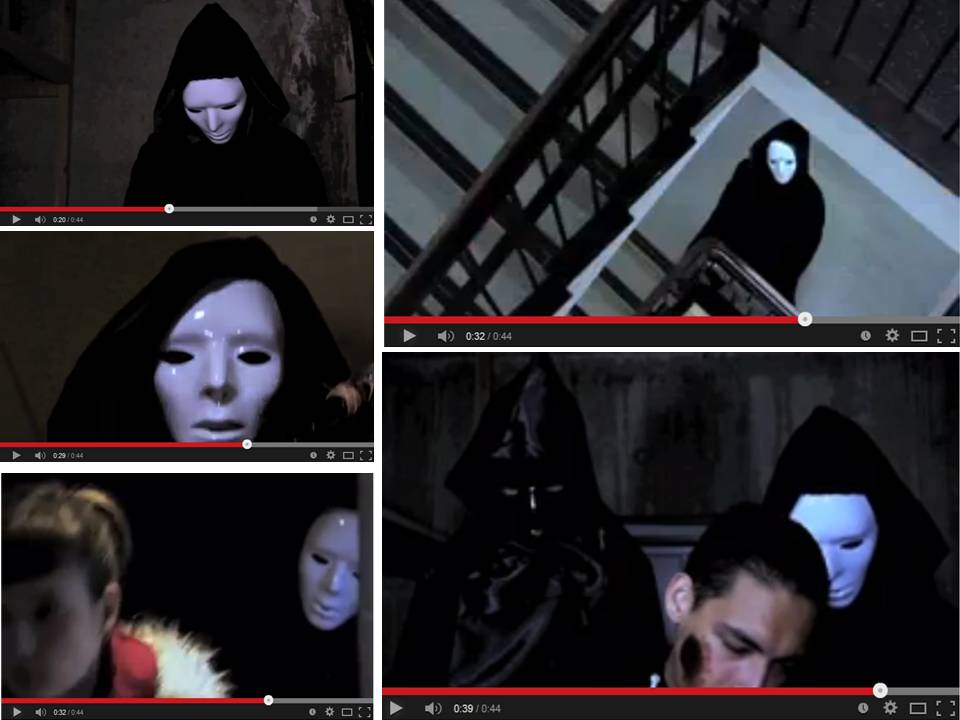
Our trailer had approximately 5 different shots of the antagonist, this is a common convention of a horror trailer i.e. the antagonist is not seen to many times in the trailer as we decided it builds tension and suspense, it somewhat gives the audience a feeling of wanting to see more of the antagonist and because of this they will want to see the whole movie. Furthermore when the antagonist was seen it was only for a few seconds again this was done just to build anticipation, the mask used was actually used to make it recognisable like other horror movies. The fact that in one shot we see two antagonists is a challenge of the common conventions of a horror trailer, this is because there is usually only one antagonist seen in the trailer. We decided to use a shot where there was two antagonists because as I said we wanted to challenge common conventions and also we thought that it would leave the audience thinking of who the main antagonist is.
|
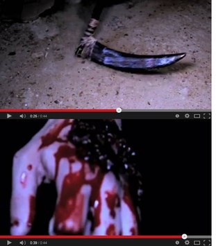
The picture above is just showing the shots that had a weapon and gore in it, as you can see there were not too many shots that showed the weapon and gore. Although there are a few more, the two above are the main two that show the weapon and gore. The fact that there were not too many shots of the weapon was done intentionally as we wanted the audience to focus more on the antagonist rather than the weapon. This is a development of common convention because we decided that although most horror movies show the weapon often; in our trailer it was not needed because as I said the antagonist was the main focus. The trailer we followed (evil dead), showed a lot more gore than we decided to use. It was decided that one shot one gore would be enough because as you can see the hand is very bloody and gory and this again builds tension and anticipation within the audience.
|
Protagonists: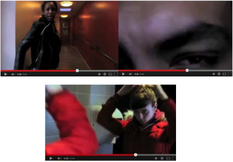
The protagonist is seen a few times, the fact that there are shots of victims leaves the audience thinking who is the main protagonist, also the fact that there are two women in the trailer also raises the question who is the final girl, all these questions build tensions and suspense. The use of many shots showing the victim is a common convention within the horror trailer as it shows the audience that there are many victims and also the fact that the antagonist is dangerous. The final girl is seen a few times but the audience do not know that she is the final girl just by looking at the trailer but this again leaves them wondering. Also the fact that one if the victims are male is also a common convention in the horror genre; we decided to follow these common conventions as we thought that there a common conventions for a reason and showing shots of the victim leaves the audience wondering if they make it out alive or unharmed.
|
Similarities;
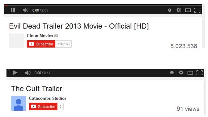
The above image is just a shot showing the trailer we followed and the similarities. The YouTube channel is similar to all movies that show there trailer online, this was the platform we used to make our trailer public just like all trailers. Furthermore the layout is the same and it just shows that our trailer does look somewhat professional and just like other trailers.
Trailer convention diagram:
Overall I believe that our trailer did have a professional look and because of this we ended up with a good looking trailer that had common conventions of the horror genre but also things that were challenged and developed to create our own trailer.
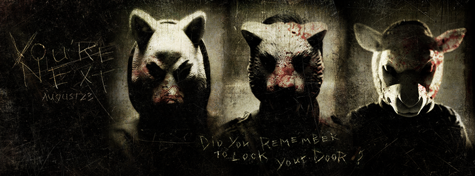
The Sub-Genre: SPlatter
|
|
|
|
Our genre was the splatter genre which is a sub-genre of the horror mainly focuses on graphic portrayals of gore and graphic violence, this is what makes this genre unique from any other sub genre of horror, although blood is found throughout the horror genre the splatter genre tends to make use of gore and blood being splatter all over the place hence the name splatter. The splatter genre includes films such as hostel, hills have eyes, the Texas chainsaw massacre and I spit on your grave, and these films each have their own characteristics which make them a splatter film.
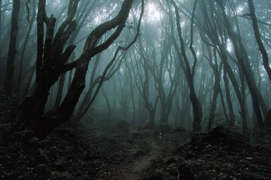
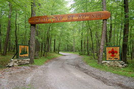
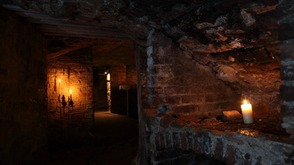
Locations:
|
|
|
The usual locations used for splatter films are dark and isolated areas such as woods, a dark cupboard, room or house. These are the most common locations for a splatter film, and keeping this is mind we decided to use similar locations such as cupboards and dark locations. The locations usually add the to the atmosphere and it usually builds anticipation within the audience, again we decided that we wanted our location to symbolise danger and hopefully our locations created the right atmosphere for a splatter film.
Characters:
|
|
|
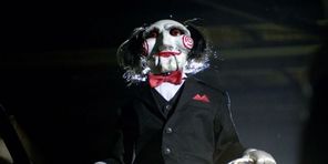
The characters in splatter films usually wear masks which usually becomes iconic, we decided that this was a main objective for our film because we also decided to use a mask in our movie, we wanted to achieve an iconic image for our mask that is why we see in image in our trailer, poster and also magazine.
Going back to characters in a splatter films, they are usually seen and then they disappear after they have done the killing, furthermore they are usually dressed in something black and they are usually much more brutal than other antagonists seen in other horror sub-genres. Considering all this information our antagonist does seem to follow the conventions of a splatter film.
Going back to characters in a splatter films, they are usually seen and then they disappear after they have done the killing, furthermore they are usually dressed in something black and they are usually much more brutal than other antagonists seen in other horror sub-genres. Considering all this information our antagonist does seem to follow the conventions of a splatter film.
Weapons:
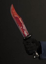
|
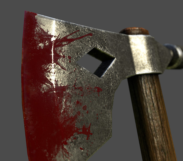
|
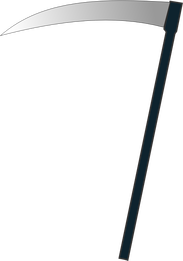
|
Weapons used within the splatter genre are again very recognisable, they usually consist of a knife are something sharp like an axe. The weapon is usually used throughout the film, which makes it recognisable, this was something we decided to do as well. We used a scythe, this is a unique weapon which makes this a challenge to the normal knife or axe.
Media (websites used)

|

|

|
We also used various different websites to create our trailer and also our website and its content such as textual analysis, though various sites were used such as Google, YouTube etc. The main site which was used and the site that we designed our website on was in fact weebly, this site enabled us to upload various different work that we had completed and as a team we then uploaded our work and made it look presentable and we somewhat gave it our own touch e.g. placing our logo and banner on the website to make it recognisable. We believe that weebly and other websites such as youtube (which we uploaded our trailer to)were useful and they enabled us to have a platform to show our work on. Sites such as Google bing were also used just to do research and also obtain images from, as I said these sites gave us a helping hand in research and hopefully producing a professional final product. Furthermore the fact that we use websites mostly everyday also gave us a understanding of how to lay our own website out e.g. navigation help etc.
