Welcome to our Evaluation Question 2 page. In this page you’ll a true insight in our film ‘The Cult’, you will also get to see our film presented across many different media platforms in order to demonstrate the combination of our main product and ancillary texts. We will be looking in depth at the synergy, identity and continuity of all 3 of our final products and then I will look into different possible forms of cross media convergence. Cross media convergence is how media producers promote a media product by creating promotional material which audiences can access using diverse forms of media platforms such as smart phones, computer games, consoles, computers, social networking sites and so much more.
Having a strong brand is important for films as a whole as it allows your audience to recognise your products as being part of the same package. In this page we will look closely and the brand identity of ‘The Cult’ and view how it compares to other real media texts. We will demonstrate elements of continuity through typography of our trailer, poster and magazine and also visual aspects which consists of the same images, range of colours and much more.
Having a strong brand is important for films as a whole as it allows your audience to recognise your products as being part of the same package. In this page we will look closely and the brand identity of ‘The Cult’ and view how it compares to other real media texts. We will demonstrate elements of continuity through typography of our trailer, poster and magazine and also visual aspects which consists of the same images, range of colours and much more.


Silent Hill mood board of synergy and media convergence.
|

Iron Man mood board of synergy and media convergence.
|
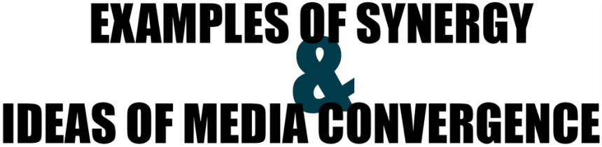
For a film to be successful, it is presented to an audience through as many different media platforms as possible, and this is where the success derives from. Many of the successful horror film franchises spend a lot of their budget on marketing the film well so that it can make a sizeable return through box office revenue. Below is just some examples of different ways in which an audience can come across a film:

Synergy and ideas of media convergence.
A good example of a horror franchise, Silent Hill (Japanese: サイレントヒル, Sairento Hiru). Silent Hill is a survival horror video game franchise created by Team Silent and published by Konami and Konami Digital Entertainment. As well as the main video game series, numerous types of accompanying merchandise have been released such as its films: Silent Hill (2006) and Silent Hill: Revelation 3D distributed by TriStar Pictures, Inc. and produced by Davis Films. It was originally directed by Christophe Gans and Michael J. Bassett and collectively grossed $149.9million. Although only making 2 movies, Silent Hill is rather successful in the horror genre.

Below are some of the posters made by the silent hill franchise for the movie. Each poster has different characters as the main image, but each individual poster has the same gritty texture and earthy undertone, and also the text used are all the exact same. This makes it a great example of continuity.

|

|

|

|

|

|

Silent Hill (2006)
Silent Hill Trailer (2006)
|

Silent Hill: Revelation 3D (2012)
Silent HIll Trailer (2012)
|
‘Silent Hill’ is mostly famous for their cross media convergence and synergy, especially its survival horror game series published by Konami Entertainment. In the Silent Hill franchise there are 10 games, include the upcoming release of 'Silent Hills’ due to be released in 2016. Time Magazine named it one of the greatest video games of all time.
The video game series developed its own unique style, yet it still maintains the same continuity characteristics in comparison to the film, such as the type tones, textures and colour schemes as well as the soundtrack, the typography is also an example of continuity as it is recognised across ‘Silent Hill’s’ franchise, this is important as it helps the audience identity the franchise, thus making it more popular.
'Silent Hill' is massively popular with Sony PlayStation as it has released majority of games, however it has taken liberty of other consoles such as Xbox 360 and Wii.


Silent Hill (1999)
|

Silent HIll 2 (2001)
|

Silent Hill 3 (2003)
|

Silent Hill 3: The Room (2004)
|

Silent HIll: Origins (2007)
|

SIlent HIll: Homecoming (2008)
|

Silent Hill: Shattered Memories (2009)
|

Silent HIll: Downpour (2012)
|

SIlent HIll: Book Of Memories (2012)
|

|
Silent Hill (1999)
|
Silent Hill 2 (2001)
|
Silent Hill 3 (2003)
|
Silent Hills 4: The Room (2004)
|
|
Silent Hill: Origins (2007)
|
Silent Hill: Homecoming (2008)
|
Silent Hill: Shattered Memories (2009)
|
Silent Hill: Downpour (2012)
|
Silent Hill: Book Of Memories (2012)
|
Silent Hills Trailer (2014)
Silent Hills is an upcoming survival horror video game for PlayStation 4 in 2016, and the ninth instalment of the Silent Hill franchise. It is being developed by Kojima Productions on the Fox Engine, and will be published by Konami. A playable teaser has been released for fans to have a feel of what it would be like and also IGN has released a game-play walk-through for those who are unable to download the game teaser. Game-play walk-through allow fans to get a little feel of how the game is like before the game is released. It might not be the same as actually playing the game it does allow the players to know whether it'll be worth it. Theses walk-throughs are made by either official MMORPG organisations or famous gamers on YouTube.
|
Silent HIlls: Game Walkthrough Part 1.
|
Silent Hills: Game Walkthrough Part 2.
|

A light novel (ライトノベル, raito noberu) is a style of Japanese novel primarily targeting middle and high-school students (young adult demographic). "Light novel" is a wasei-eigo, or a Japanese term formed from words in the English language. As Silent Hill derived from Japan they are popular with light novels in Japan and are translated into English to suit the preferences of majority of fans and later on can be translated into different languages to reach out to fans globally, this also helps their franchise to grow. All the 'Silent Hill' light novels were released in 2006, 3 of the novels where based of the games and the last one was base on the movie.
The continuity of the light novels match the films, the use of harsh reds, mustard yellows and earthy tones, shows that it is a huge part of the franchise.
The continuity of the light novels match the films, the use of harsh reds, mustard yellows and earthy tones, shows that it is a huge part of the franchise.

Silent Hill (2006)
|

Silent Hill 2 (2006)
|

Silent Hill 3 (2006)
|

Silent Hill: The novel (film 2006)
|

In 2004, IDW Publishing began production of a series of Comics spun off from Konami's 'Silent Hill' series. To date, nine distinct titles have been released across many different issues (including 'Hunger' 2006). With the exception of Sinner's Reward, Past Life and Anne's Story, all titles were written by Scott Ciencin, while illustrations were provided by various artists.

Silent Hill: Dying Inside (2004)
|

Silent Hill: Among Damned (2004)
|

Silent Hill: Paint It Black (2005)
|

Silent Hill: The Grinning Man (2005)
|


Silent Hill: Dead/Alive (2006)
|

Silent Hill: Sinner's Reward (2008)
|

Silent Hill: Past Life (2010)
|

Silent Hill Downpour: Anne's Story (2014)
|


Even through the 'Silent Hill' Website their level of continuity is strong, it is precise and consistent and strongly relates to the actual film, games and books so it is easily recognised by their target audiences. Going through the website makes you want to stay on it much longer, as you manoeuvre through the page with your mouse the page moves accordingly to the movements of your mouse and it really gives it that in home 3D experience making people want to watch the movie.

|

|
'Silent Hill' was brought into reality in 2012, Universal Studios (Hollywood and Orlando) by making it into a walk-through maze experience. The maze combines elements from both the games and the films. Songs and sounds from the Silent Hill soundtrack, as well as various scents are inserted into the atmosphere to increasing the realism. The target audience are therefore allowed to experience the movie in real life, even though it wouldn't be as real as it would be in the movie, they would get a feel of it.

|
|
Due to the high popularity of the 'Silent Hill' franchise, the merchandise is actually high in demand and this creates even more popularity for the franchise. The merchandise is very diverse from T-shirts to action figures to travel mugs. There's also a sense of continuity by using similar colour schemes and also main characters. Most of the merchandise are surprisingly fan made and they do actually sell, this is to show popular 'Silent Hill' actually is. As more and more people buy their merchandise the company continues to benefit from it and so do other small organisations such as Redbubble, Zazzle and people who sell through Ebay.

|

|

|

|

|

|

|

|

'Silent Hill' has numerous amounts of fan pages all over the web. A fan page (also known as : Fan site) is a website developed and maintained by a fan or devotee interested in a certain entity, celebrity or a cultural phenomenon. People dedicate their time, passion and even money to make sure their fan pages truly emphasises what entity they are interested in. Silent Hill is even advertised on social networking pages made by fans such as Facebook and Twitter.

|

|

|
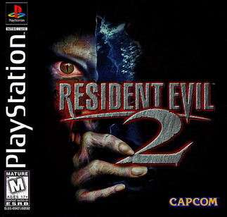
Similarly to the 'Silent Hill' franchise, a great example of a horror franchise that uses Synergy and Cross Media Convergence effectively and adequately is Resident Evil. Only difference between Silent Hill and Resident Evil is that Silent HIll only made 2 films in their franchise, whereas Resident Evil made 5 and there are rumours for a 6th movie to be released. Resident Evil is a franchise based on the video game series (like 'Silent Hill') developed and published by CAPCOM. The film series consists of five films ranging from 2002 to 2012, with one additional movie rumoured to be released in 2016. Distributed by Screen Gems, Resident Evil has become known as the most successful movie based on a video game series due to its collection of $915 million through a budget of $248 million.
Below are the posters for the resident evil movie franchise. The ideal of continuity is based on mainly the main female protagonist and increases it's level of continuity by having her as the main image. Also the movie title has the same font flowing throughout making it recognisable as well with the main protagonist at the front.

Resident Evil (2002)
|

Resident Evil: Apocalypse (2004)
|

Resident Evil: Extinction (2007)
|
|

Resident Evil: The Final Chapter (rumour)
|


|
Resident Evil (2002)
|
Resident Evil: Apocalypse (2004)
|
Resident Evil: Extinction (2007)
|
|
Resident Evil: After Life (2010)
|
Resident Evil: Retribution (2012)
|
Resident Evil: The Final Chapter (rumoured)
|

Resident Evil: Degeneration: known as (Biohazard: Degeneration in Japan) is the first full-length motion capture CG animation feature in CAPCOM's Resident Evil franchise. The film was made by CAPCOM Studios in cooperation with Sony Pictures Animation and Sony Pictures Entertainment. Degeneration made its première in Japan on October 11, 2008 at the Tokyo Game Show, and was released nationwide one week later on October 18.
Resident Evil: Damnation: known as (Biohazard: Damnation in Japan), is a 2012 Japanese feature-length computer-animated horror 3D film by CAPCOM and Sony Pictures Entertainment Japan and is directed by Makoto Kamiya and produced by Hiroyuki Kobayashi. It is a sequel to Resident Evil: Degeneration, and released on October 27, 2012 in Japan, premièring in Shinjuku, Tokyo.
Unlike the Resident Evil live-action film series,The anime films however are set within the same universe as the original video game series this therefore benefits those who enjoy the game series far better than they enjoy the film series, thus therefore appealing to both parties.

Resident Evil: Degeneration (2008)
|

Resident Evil: Damnation (2012)
|
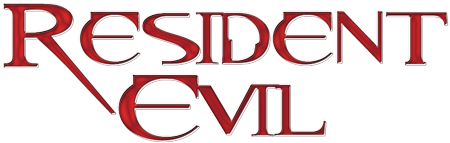
One of the major factor of Resident Evil is brand identity. Despite being based upon the Resident Evil video game series, the two don't share the same typography for the words "Resident Evil". When comparing the original logo for the video game series with the current typography used for the film series it is easy to see why the film series is so successful as it is very eye grabbing and also why many people are unaware that it is in fact the film series that is based upon the video games and not the other way around. Although the video game series has developed its logo to a much more modern and exciting font, it is very clear to see that the film series carries a much more stronger logo in terms of branding and marketing, people easily recognised the brand through the film series logo. The typography is recognisable as 'Resident Evil' and is an important factor when measuring the films overall success in the industry.

|

|
The video game series has developed vastly as the film series found success and now has a strong brand identity in its own right. Although the logo is different to that of the film series, it is still very unique and has been used on all of the recent Resident Evil video games. Some of the games, most notably Resident Evil, Resident Evil 2 and Resident Evil 4, have been bestowed with multiple Game of the Year honours and often placed on lists of the best video games ever made. In 2012, Complex ranked Resident Evil at number 22 on the list of the best video game franchises.That same year, G4tv called it "one of the most successful series in gaming history." The game series has sold 50 million units as of 2012. The video games series has been released on many different consoles such as Gameboy, Xbox, Playstation and Wii.


Residebt Evil (1996)
|
Resident Evil 2 (1998)
|

Resident Evil: Nemesis (1999)
|

Resident Evil 4 (2005)
|

Resident Evil 5 (2009)
|

Resident Evil 6 (2012)
|

|
Resident Evil (1996)
|
Resident Evil 2 (1998)
|
Resident Evil: Nemesis 3 (1999)
|
|
Resident Evil 4 (2005)
|
Resident Evil 5 (2009)
|
Resident Evil 6 (2012)
|


Resident Evil: The Umbrella conspiracy (1998)

2nd edition
|

Resident Evil: Caliban Cove (1998)

2nd edition
|

Resident Evil: City Of The Dead (1999)

2nd edition
|

Resident Evil: Underworld (1999)

2nd edition
|

Resident Evil: Nemesis (2000)

2nd edition
|

Resident Evil: Code: Veronica (2001)

2nd edition
|

Resident Evil: Zero Hour (2004)

2nd edition
|

Resident Evil theme restaurant Biohazard Cafe & Grill S.T.A.R.S. opened in Tokyo in 2012. It appears to be a cross between the video game series and the film series with the logo sharing the typography from the film series however there appears to be characters from the video game series mocked up in chef hats. This shows just how strong and increasingly popular the Resident Evil brand identity really is becoming.


|

|

|

|

|

|

The 'Resident Evil' franchise is extremely popular, the merchandise is very high in demand and even more popularity for the franchise. The merchandise is very diverse from T-shirts to action figures to wall posters. There's also a sense of continuity by using similar colour schemes, same style fonts and also main characters. Most of the merchandise are surprisingly fan made and they sell, this is to show popular 'Resident Evil' is actually is.

|

|

|

|

|

|
'Resident Evil' has multiple of fan pages all over the web. A fan page (also known as : Fan site) is a website developed and maintained by a fan or devotee interested in a certain entity, celebrity or a cultural phenomenon. People dedicate their time, passion and even money to make sure their fan pages truly emphasises what entity they are interested in. 'Resident Evil' is also advertised on social networking pages made by fans such as Facebook and Twitter and even Instagram.

|

|

|

|

|
FONT: The fonts used throughout The Purge: Anarchy trailer are similar to that of its poster. The beginning captions used “Some do it for revenge” “Some do it for fun” “Some just try to survive” are similar to the caption used on the poster. This is very important so that there is a substantial amount of continuity between the two and so they don't appear to be from two completely different films. Another reason this is important is because of brand identity, particularly if the film is part of a franchise, this is the sequel to the first movie “The Purge” and having a strong brand identity for the movie makes it more recognisable.

|

|

|
COLOUR SCHEME: The colour scheme used in the trailer in the are identical to that of the poster. Almost throughout the trailer it has that gritty texture to it which Is clear to see on the poster, also likewise to the poster it has the green, mustard yellow and black undertones more or less consistently throughout the whole trailer which also increases it’s continuity.

|

|

|

|
CHARACTERS: In the main poster, the characters in the shot are the antagonist in the movie with their masks on in the dark this gives it it's creepy look and also it's very interesting to have an antagonist as the main image because it makes people wonder what they are doing and why they are there. In the trailer we see a caption saying "Some do it for fun" and the face that comes up is the antagonist in a mask and this sorts of gives away what exactly their role is in the movie. The poster features about 5 people in the main frame and others in the background, looking straight into the camera as though they're staring at a target.


|

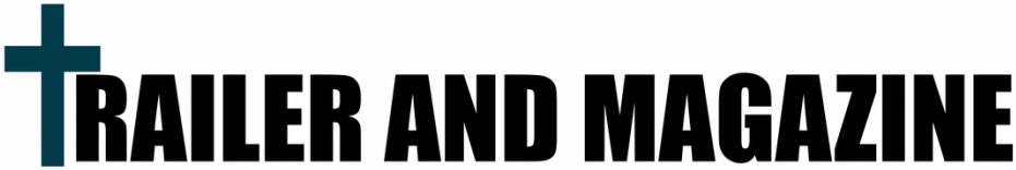
The font for the title of our film is called Impact and we undertook a lot of research before we came to the decision to use it for our film and we decided to use it as it's very simple sharp and slick. The same font is used in our trailer and poster and using the same fonts, with the same colour helps with brand identity.
|

|

|

|
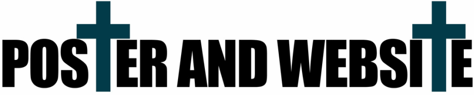
The font used for the captions "WHEN YOU HAVE NO HOPE RUN" "HAIL THE CULT" in the trailer is the exact same font we used for our tagline "Your soul is our pleasure" on our poster called High Tower Text. Again we wanted the the text to be plain and simple but also attractive and we thought this font would work really well against the font we had for the title.

|

In keeping continuity between our trailer and poster we added an element that is similar to the poster poster was the negative inversion of the image. On Photoshop we made a new layer and coloured it in an off grey colour and changed the blendiing options to 'difference' which gave me the texture that we have on our poser right now. This helps with brand Identity and continuity.
|

|

|

|
We wanted our trailer to look dark and gloomy as a common horror movie convention, however because we mainly filmed at day time most of our shots were bright so that had to be changed on final cut to make it slightly darker. The poster itself looks light and dark at the same time as it looks really dark at some places and then looks light at some places, we liked that because we believe it goes with the trailer. Also we gave the trailer a blue tint this is because we wanted the continuity from the poster to run into the trailer.

|

|
FONT: After looking at different magazines and their corresponding trailers, we concluded that not many magazines use the exact same typography for the title of a film when it's on the cover of an issue, however they do often use similar fonts, especially when the cover line is directly related to the film. On this Evil Dead edition of Scream magazine the font used for the title of the film is similare to the font used in the trailer at the end, and can be recognised by fans.The fonts used for the captions are really similar to the fonts used on the magazine like the title.
COLOUR SCHEME: The colour scheme of the magazine is similar as the colour scheme used in the trailer. Most of the cover lines on the magazine are white, which is the main colour used on the captions itself. The trailer does have some yellow and green undertones and this goes well with the cover lines in yellow. Also the background of the magazine is very dark and gloomy which is similar to the actual theme and concept of the trailer also it matches the trailer as it is very dark.
COLOUR SCHEME: The colour scheme of the magazine is similar as the colour scheme used in the trailer. Most of the cover lines on the magazine are white, which is the main colour used on the captions itself. The trailer does have some yellow and green undertones and this goes well with the cover lines in yellow. Also the background of the magazine is very dark and gloomy which is similar to the actual theme and concept of the trailer also it matches the trailer as it is very dark.

|

|

|
CHARACTERS: The main image on the magazine features Jane Levy as 'Evil Mia' on its cover and she is basically the antagonist of the film and she is featured as "Good Mia" and "Evil Mia" throughout the trailer. In the trailer we see the build up of how Mia tells her friend to get her out of the place that they are and we also see her run into the woods where she is tortured by vines on a tree and then turns into 'Evil Mia'. Having 'Evil Mia' at the front of the magazine is essentially crucial as that's the actual evil in the movie and that's what attracted people to watch the movie in the first place.

|

|

|


|

|
Font: After we had looked at different magazines and their corresponding trailers, we found that not many magazines use the exact same typography for the title of a film when it's on the cover of an issue, however they do often use similar fonts. However we decided to use the same font for the title of our film in both our main product to keep the continuity. The font we used on the magazine is called Impact and that's the same font we on movie title, we did this so that our fans would be able to recognise the name of the movie regardless of the colour change. Also the masthead on the magazine is similar to the font used in the captions of our trailer.

|


|
Character: Similarly to the Evil Dead magazine, we decided to use the main antagonist as the main image in the magazine, to continue that idea of continuity, however we didn't make our protagonist the main image. We preferred using the main cult member as the main image for our magazine as he is featured in most if the scenes in the trailer, but not as much as Mia is featured in Evil Dead because we don't want to give away too much to the audience, rather have them question what the purpose for the cult member is.

|

|

|
|
|

|
FONT: I picked ‘GONE GIRL’ because it has a very interesting website, it has a lot of fonts in it that relate to the movie e.g.. The news broadcasting rather that the title, which makes it very interesting, however the fonts used on the headers are very identical to the title, which shows continuity with the ancillary texts.
COLOUR SCHEME: The colour scheme present throughout the whole of the trailer is practically identical to that of the website. The colour yellow is used through the trailer and we can see it is used in the website as well.
CHARACTERS: The movie mainly centres around Nick Dunne (Ben Affleck) and Amy Dunne (Rosamund Pike) and having them on the front page of website shows the continuity of the film. Also snippets of the movie are place don each page, so that fans can relive moments from the movie on the website.
|
|

|
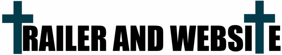
Font: The font we use in our website is more or less similar to similar to the font we use in the trailer and the same as the font we used on our movie poster, we did this so that our target audience can recognise our movie as soon as their in out website and also feel as though they are part of the movie.
Colour scheme: The colour scheme present throughout our trailer and website was mainly blues, blacks and reds. Our trailer is dark in contrast to our website, reason we decided to run with this is because the continuity of the colour scheme still flows regardless if it was dark.
Characters: Throughout our website we tried to make it as horrifying as possible by having gifs of deformed characters and lots of blood. reason we did this was because we didn't just want pictures of the cult floating everywhere as people will lose interest so therefore we decided to add horrific and deformed gifs that we found personally intriguing to our website so that our audience can enjoy being a part of our website.

|

|

|

|

|
FONT: After looking at different magazines and their corresponding posters, we concluded that not many magazines use the exact same typography for the title of a film when it's on the cover of an issue, however they do often use similar fonts, especially when the coverline is directly related to the film. The font used on the magazine for the film title is different to the actual film title on the ‘Scream 4’ poster but it is not entirely dissimilar and works well with the rest of the magazine.
COLOUR SCHEME: The colour scheme of the Scream magazine is slyly similar to the colours used in the poster. The black edges make it more gloomy and actually does carry on it’s continuity. The background is red which does correlate with some of the text on the poster and the coverlines are in white, which links to the masks and the title of the film.
CHARACTERS: The SCREAM franchise gains majority of it’s popularity through it’s main antagonist ‘Ghostface’. Thus therefore why the magazine used ‘Ghostface’ as their main image, because that is how people recognise the movie even without the title of the movie.

|

|
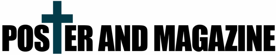
As our researched proved that our magazine and poster did not have to be identical, we decided to follow that convention and allow two different people to work on the two different products, however to have a strong sense of continuity we decided to have the main antagonist the main image in both the poster and the magazine and also we used the same font on the magazine as the poster to have strong brand identity, but we did not have them in the same colour.
Font: The fonts used for main cover line and cover lines of the magazine is the same font we used for our movie title on our poster, we wanted to minimise the font usage on our magazine and make it simple and slick so there if not too much going on the magazine so that it doesn't look extremely busy. The font we used for the masthead on our magazine is quite similar to the one used on our tagline 'Your Soul Is Our Pleasure'. We didn't want all our font to be 'Impact' as it would be too plan.
Colour scheme: On our poster we used icy blues, greys, dark red and black in contrast to our magazine which has sharp reds, mustard yellows and white. As seen in real media texts, the magazine and the poster do not necessarily match as they are not made by the same company however similar colours and fonts can be used for brand identity like 'Scream'. Even though our magazine directly contrast each other, the continuity still works as the movie is still recognisable to our target audience.
Character: Our main character is the main antagonist wearing the cult mask. We decided to pot the main antagonist as our poster main image as well as our magazine, this is due do brand identity and to display strong continuity as our target audience will be able to recognise our franchise through the mask of the cult so it is important having the main antagonist as the main image.

|

Website

|
FONT: This is an amazing example of perfect continuity between a film poster and the website for that very same film. The font, colour scheme and characters are exactly the same because the images displayed are exactly identical. World War Z font is very simple yet very recognisable. The font used in the website is very strong and quite bold which is very similar to that of the poster.
COLOUR SCHEME: The colour scheme used in both poster and website are exactly the same because the images are identical. They both have very dark tones and gritty texture, which makes them both very recognisable to any World War Z fan.
CHARACTERS: The Brad Pitt is featured on the poster as well as the website for a strong continuity and ancillary texts.

|


In keeping with the continuity between our main product and ancillary texts, many of the pages on our website, including this one, feature the same font used for the film title on our poster.
Also the banner like many famous films is similar to the poster in having the main image as the poster on the website. Also we have the website light because the poster is light furthermore we tried to be consistent with the colour scheme by sticking to reds and black to match the poster ancillary texts and to have strong continuity. |
|
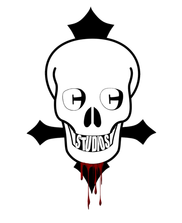
A 'Logo' is a symbol or word mark used by commercial enterprises and organizations to promote and support instant public recognition. The logo for our production company, Catacombs Studios, features on our film poster, website, and on our main product which is our trailer. Instead of using an alternative logo we decided to leave it as it is. Our logo colours consists of black, white and red (for the blood) The colours that have become synonymous with Catacombs Studios and our work. It's important that we featured our logo in our trailer, our film poster and our website because it helps to distinguish brand awareness amongst our audience.
|
Successful branding of a film or franchise could be the difference between grossing over 100 million at box office or grossing well under 100 million so it's important to get it right. Particularly when starting a film franchise or series, branding is everything. In the film industry, there is a fine line between box office sensation and box office flop so getting the basics right is fundamental. Brand identity is a lot to do with three key things; the name of the film, the typography used and the colours used. When we mention the colours used, it's not to say that on every single media platform the name of the film will be the same colour, but rather whether the colours used are synonymous with the film. A strong branded film will be one that is instantly recognisable amongst its audience simply from the film titles typography.
|

|

|
Throughout all of our final products the the exception of our magazine, the film title, 'The Cult' is written with the same font and also in the same colour. Although consistency is important when creating a strong brand, the colour is something we were happy to change in context and in order to fit the colour scheme of which ever media platform it's on. We feel as if the typography we've chosen to depict our film title has the potential to be an extremely strong brand and could easily work for as many sequels as the Paranormal Activity film franchise.

Similarly to other film posters, which have multiple posters with the same colour scheme, we decided to do one more, but this time with the protagonist instead. We made sure features like the blood tear was kept for an even stronger brand identity. To keep the continuity, we left the same font and colours so it's easily recognised by the public.

Poster 1
|

Limited Edition Poster.
|

Picadilly Circus Advertisement.
|

Billboard.
|

London Underground Banner.
|

Bus Advertisement.
|

London Bus stop Advertisement.
|

Advertising on a bus shelter would enhance public awareness as different types of people go there everyday. Having an attractive image there is key, so we decided to use our main poster as it is simple and eye catching. Also we thought we should show our magazine being sold at a shop. Lots of people visit shops everyday and using bright colours such as red and yellows, it will catch someone's eye.
|

Due to the popularity of the social networking site Facebook, we took inspiration from other real media texts examples and made a fan page, which was made by the biggest CULT fan there is and is followed by millions of people and this helps raise awareness.

Novel Front Cover.
|

Anime Series Poster
|
We decided to make a novel front cover and anime poster. Our modern society today has adapted such so almost everything is technology based, however books are still cherished which is why we chose to make a novel - in order to get audiences who are more interested in books than they are in movies, this will increase our popularity. We used the same ancillary texts and the exact same colour scheme and character to increase continuity. We also decide to make an Anime poster, because Japanese animation are becoming increasingly popular in today and are even more popular in Japan, Asia, South Korea and America, so making an anime series would mean that my product will be able to satisfy a lot of people around the world , especially if successful. As is is animation, we decided to use and animated poster, by keeping constant level of continuity we used the same colour scheme, which made it clear that it was our product.

Xbox One.
|

Playstation 4.
|
By producing exclusive special edition consoles, we would be expanding our public awareness range even further. More and more people buy customized consoles especially when it's from their favourite movie. We used the same texts as well as similar colours used in our trailer and poster for a sense of continuity.

IPhone 5s.
|

IPhone 6 Plus.
|

Beats by Dr. Dre.
|
Similarly to the Xbox and PS4 consoles we decided to make customised IPhone 5S, 6 plus and Beats by Dr. Dre. We used the same colour scheme as the consoles for continuity. We also added the cross to show our brand identity. We chose to do this because our main target audience are teenagers, who would use the latest technology, so therefore the can have custom made 'The Cult' merchandise.

Google Play Store.
|

Google Play Store Movie and TV.
|

Google Play Store Newsstand.
|

Google Play Store Games
|

Google Play Store Books.
|
We decided to show the popularity of our franchise by putting it on Google Play Store in the formats of a game, book, film and magazine. As the cross in our franchise is very popular we decided to play about with it and do something to make it significant, whilst making it related to the movie poster so we decided to make it quite similar to the poster and we made our gaming app poster. Having our products with strong continuity on Google play enhances the strength of our product and will increase popularity.

IMDb is the world’s most popular and authoritative source for movie, TV and celebrity content. The IMDb consumer site (www.imdb.com) is the #1 movie website in the world with a combined web and mobile audience of more than 200 million unique monthly visitors. IMDb offers a searchable database of more than 180 million data items including more than 3 million movies, TV and entertainment programs and more than 6 million cast and crew members. Having our product featured on IMDb would mean that our audiences will be able to search and locate us quicker and they get t know more about or franchise and movie. The poster used was the second poster we made, This poster is identical to the 1st poster we made except it has a victim at the front page instead of the main antagonist. The same colour scheme was used to highlight our use of continuity and ancillary text.
The success of a franchise is determined on different aspects such as brand identity and continuity. Displaying continuity unifies ancillary texts into the same franchise, whilst also assisting the target audience in recognising individual products within a certain franchise. Looking at real media text examples such as 'Resident Evil' and 'Silent Hill', we now understand how they have used branding and continuity effectively in order to exceed expectations and the gross revenue at box office.
By analysing branding and continuity, we have produced a package in which our ancillary texts and products are linked together. Personally, we have successfully used these elements in our main products and additional ancillary texts all share similarities with typography, the cold blue, grey and dark red colour scheme, the crosses used in the texts and the main antagonist.
Finally, we were able to expand our film product into a wide variety of visual media products on a diverse amount of media platforms from the use of Cross Media Convergence. By producing products such as public advertisement, a novel, anime series, fan page and additional merchandise, we have expressed our enthusiasm to work with other large companies in order to achieve elements of synergy. We constantly transferred an equal level of consistency through our main products as well as ancillary texts, conclusively regulating an effective use of brand identity.
