We wanted to have an original logo, so we decided to make one from scratch. Whitney-Anne was in charge of designing the logo and also bringing it to life on Photoshop.
Here is what the logo looked before.
Here is what the logo looked before.
|
|
|
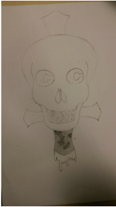
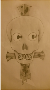
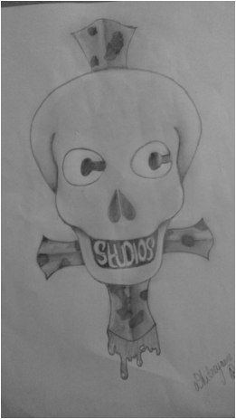
Here are the fist couple stages of the logo drawn by hand, we thought it would be a good idea to have the 'C's in 'Catacombs' on the eyes so that it seems as though it's looking at something and then we decided to use studios as the teeth and make them a bit crooked so the skull look a bit crazy and we found out that this actually works quite well. We decided to develop this on forward.
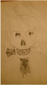
These are the final drafting result.
|
|
The next part, the logo had to be digitalised on Photoshop, which was actually the hardest part of the logo development stage. As the digitalising process was taking place, as few changes were made to the logo, in order for it to look professional and nicely presented.
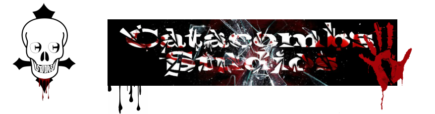
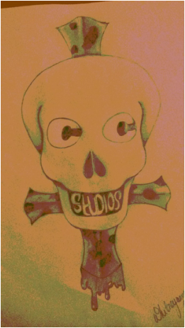
HERE IS WHAT THE LOGO LOOKS LIKE NOW.
HERE IS WHAT THE LOGO LOOKS LIKE NOW.

Achieving this look for the final product was not an easy process at all. We couldn't digitalise the original skull that we had, as it was proven to be very difficult, so we decided to take a skull image from the internet and play around with it. Putting the 'C's for catacombs in the eyes the most challenging part because we couldn't get a font that would match the eyes, so we had to use the brush tool quite a lot when doing this, which ate up a lot of time. Later on we decided to change the knife at the back to an upside down cross, which implicates religious elements of a catacomb.
EXISTING HORROR MOVIE LOGOS
Here are some existing logos in the horror movie industry which we particularly like.

Blum - describing the mental state of depression which follow a bout of chronic constipation. With the meaning of the word 'Blum' the logo works well. 'Blum House' and the background is dark and gloomy, almost depressing. We like the way it shows the corner of a building with a light bulb on the ceiling, implying that it is a home.
|

We liked this logo because it's simple yet eye grabbing, the circles in the middle are different colours and the word of is in a different colour to 'circle' and 'confusion' implying that this truly is a confusing circle where everything is different from everything else, and because it's such a clever play on words it's very memorable.
|

This logo is very eye-catching, we liked the way the words and the background actually link with each other such as 'Dark' the background is... dark but 'Dark Castle gives it a sense of mystery and gloom. The use of colours were very effective. Using light colours on dark colours makes it more noticeable to the audience.
|

This is one of our favourite logos as it has a skull similar to that of our logo. We like the fact that the makers of this logo used a skull to represent a ghost making it more horrifying. We also like the fact that the skull is placed behind the key hole almost trying to look inside the 'house'. Brilliant idea for a logo.
|
