
Whitney-Anne Ideh.
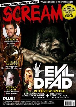
Magazine name: Scream
Magazine website: www.screamhorrormag.com placed at the top of the magazine, placed at the top and not in bold letters.
Issue number: 17. This is at the side at the side of the magazine, it is also placed on top of the price, so this makes the issue number noticeable to the audience.
Barcode: is placed at the bottom of the page, out of the way, not obscuring the image in any way.
Dateline: May/June 2013 placed right above the barcode, so it is out of sight and not distracting.
Masthead: The word ‘Scream’ is in red, big, bold letters. The font used is used to connote death and terror and it shows blood dripping off the letters. It really emphasizes the fact that this magazine is in fact a horror magazine.
By having it in big letters, it means that the Masthead cannot be missed and will be noticed by the audience when they purchase the magazine.
It also bring some sort of colour/life to the magazine and colours used are dark colours, white and yellow, so using a red will really make it stand out more than the other colours especially because it’s quite big.
The Masthead can actually be used to emphasise the ‘Evil Dead’ as colours that mainly follow ‘evil’ and ‘death’ tend to be red and also associated with lots and lots of blood. Also the film itself is a Splatter film, so then again it already gives you a feel to what the movie is about.
Main Headline: The main headline is almost the same size as the masthead, this shows that the main headline is just as important as the masthead. I think the main headline was made big because film fanatics will probably notice the main headline primarily before the masthead and this would probably drive them to buy the magazine, it’s probably the same reason why the main headline’s colour is in white, making it brighter than everything else on the page, so it is more noticeable to the audience. Next to the main headline there is a hand at the side of it almost reaching out to the audience, which actually supports the movie advertised and as well as the main image. The main headline is in white big, bold letters and in a very interesting font, so this makes it eye catching to the audience.
Coverlines: The Coverlines are positioned at the bottom of the page and at the side, out of the way, not obscuring the main image or main headline. Most of the coverline are mainly interviewee’s names and movie titles. The coverlines are in bright colours too but they are not to distract the audience, they are bright because the background is quite dark due to the main image. They are some coverlines that are different from others, for example ‘Interview special’ is yellow because the editor wants the audience to notice that coverline as it might intrigue them to buy the magazine to find out who was interviewed and how it went.
Main image: The main image consist of a female smiling at the camera, looking at someone she wants to get but they are running away from her (maybe) and she’s enjoying the trill. She looks possessed or she’s just an evil spirit seeking revenge. What I find interesting is that her hand looks as though she’s trying to reach for something, which is the same as the hand next to the main head line, this could actually be her hand reaching out to the audience.
Her skin and her teeth which are black, looks as though it is rotting way which could signify that she is dead, hence the title ‘Evil dead’ also he eyes are very intensifying almost as if she loves what she’s doing, also links to her smile, seems as though she’s enjoying herself and what exactly she’s doing. In the main image there are chains at the side, which could mean that she is trying to break free from somewhere she was locked in, possibly the basement. On her hand, it seems as though there is a cut, maybe the victim she was hunting down had managed to cut her.
Jacob Fritze.
Film Title: Evil Dead
Release Date: 8th March 2013
Director: Fede Alvarez
Production: TriStar Pictures, FilmDistrict, Ghost House Pictures
Principle Cast: Jane Levy, Shiloh Fernandez, Jessica Lucas
Sub-Genre: Horror/ Paranormal
Film Info: The Evil Dead is an American horror film franchise created by Sam Raimi consisting of four feature films.
Synopsis: Five friends head to a remote cabin, where the discovery of a Book of the Dead leads them to unwittingly summon up demons living in the nearby woods. The evil presence possesses them until only one is left to fight for survival.
Mise-en Scene: The front cover of the magazine Scream gives the audience a quite large overview of what the reader can expect to see in the magazine. The main picture shows and evil looking woman out of the film “Evil Dead”. The lighting is quite dark so that the audience only can see the woman’s face and her hand. Her face looks scratched and destroyed from torture, but yet she is smiling in the camera, which gives a quite disturbing and controversial impression of what the film could be like. Also the audience can see very inconspicuous a chain on the right side next to the woman, which connotes that she is most likely imprisoned. However more towards the left side, the front cover is divided and shows in a frame three different pictures of actors as well as one character out of the film “Silent Hill”. The character from “Silent Hill” (“Pyramid Head”) is shown in dark lighting and environment, however his arms are highlighted with bright light to highlight his muscles, which connote strengths.
Camera: The main picture of the front cover is shown as a close up, which let audience focus on the scarf and the destroyed face of the women. Furthermore when showing the woman as a close up, she seems much scarier as if they would show her as a long shot in which the audience can see her ‘female’ body that might would not scare the victims away as they might see it as weak. The three pictures in the frame on the left side are all shot as close up, due to it shows real people and there wouldn’t be enough space to show them all as a mid or long shot, which makes it reasonable just to show their face.
Colour: The colour scheme of the front cover is generally black, white and red, whereas black is definitely the dominant colour. The high usage of black is due to the general convention of Horror, which uses black or other dark colour to scare the audience or make them aware that there might be something unexpected in the dark. The masthead of the magazine is red which connotes blood. The main cover line of the front cover is in white to create a strong contrast from the dark theme and to highlight it. The selling line and all the other content that refers to special offers within the magazine is yellow.
Typography: The font of the masthead “Scream” is easy to read for the audience, however the writing looks as if blood would drop down from each letter, which is a typical convention of Horror. On the other hand the main cover line is in bold and straight letters, which makes it easy to read, as well as it has the same font for the name “Evil Dead” as the Production company of the film chose for the DVD cover. This therefore could remind the audience when seeing or purchasing the DVD.
Mood & Styling: The styling of the woman from “Evil Dead” on the main image looks quite rough and disturbing as she has the look as if she is already half dead. Furthermore the mood of the whole front cover looks dark, scary and to an extent depressing.
Specific Conventions: The “Scream” magazine front cover follows a lot of typical Horror conventions.
Specific Conventions: The conventions followed by this magazine front cover are quite typical for Horror magazines. It starts with the font of the masthead, which is red and looks like blood would drop down from each letter, which is a typical element used in Horror. Furthermore the colour scheme is typical dark, which gives a strong contrast to the white main cover line. Also the cover is quite packed with different pictures, which is also a typical convention for Horror magazines, to give the audience a lot of information’s about what will be available in the magazine.
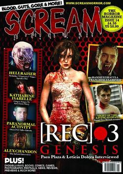
Fadeke Faluyi.
SCREAM Magazine Front Cover
MASTHEAD (LOGO): The masthead is red and bold with a white outline which contrasts from the rest of the background and photos which makes it stand out. Red connotes blood and gore which tell us that this is a horror movie magazine.. The title is ‘SCREAM’ which tells us that the articles will be intense and full of horror. The font is dripping blood which looks like something written on mirror is thriller/ horror movies.
DATELINE: The date line in located on the right hand side on the bottom, in very small text just above the barcode. Its next to the pricing which tells us that ‘SCREAM’ want that to be the least of your focus and more on the picture and cover lines.
MAIN IMAGE: The main image is of the ‘bride’ from REC 3. The image is eye catching because she is covered in blood and is holding a chainsaw. Also, the fact that it’s a woman in a dress draws attention as it’s often a man that is normally portrayed that way. It’s an interesting image which makes you want to know what’s going on and what it is about.
MAIN COVER-LINE: The main cover line is ‘[REC]3 GENESIS- Paco Plaza & Leticia Dolern Interviewed’. If you’re familiar to [REC] or are a big fan of the films, the main cover line will interest you. It is every simple and straight forward and it doesn’t need to be too attentive as the main image makes up for that.
COVER-LINES: The cover lines and in yellow to make them easy to read due to the red and black background. Personally, I think it makes the magazine look a bit cheap. Each cover line has a picture with it which assures the reader that the magazine is full of interesting articles.
BAR CODE: The bar code is located on the bottom right which is the ideal size for a barcode.
SELLING LINE: The selling line is ‘Blood, Guts, Gore & More’. This suits very well with the masthead and blood that is featured in most of the images. It’s easy to remember and fast to say, this makes it sound fun.
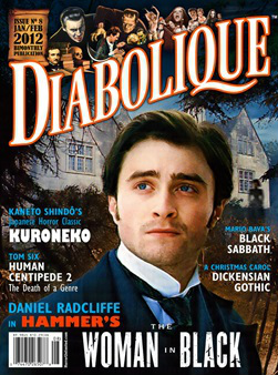
Eugene Neil.
The film on the cover is the woman in black.
Release date: 3rd February 2012
Sub genre: Drama, Horror, Thriller
Film info: This film is actually a remake of the 1989 TV film called the woman in black, the setting and the story is the same/very similar.
There is a sequel of this film coming out in 2015 called the woman in black: angel of death. This could be because the first film was a success of it could just be because there is a three part instalment (trilogy)
Synopsis: A young lawyer travels to a remote village where he discovers the vengeful ghost of a scorned woman is terrorizing the locals.
Colour: The horror magazine I have chosen is diabolique, as you can see the colours used are quite dull except for the houses at the back, this itself creates a creepy feeling as it sets an old Victorian/mysterious scene. The fact that it seems to be black around the corners connotes evil, this is because black is a dark colour that suggests mystery and danger. Also the fact that the suit that the subject is black again connotes danger and evil, the fact the he is wearing all black could suggest a funeral or death, it also makes the audience wonder whether the subject will be in danger.
Lighting: The lighting seems to be light faded into a darker shade, as I said before this connotes danger as it suggests that the subject is in danger, it also makes the reader feel like the dark is slowly closing in on the subject.
Font: There seems to be two different fonts used in this magazine and the main two colours used for heading are white and orange and the two colours used for the sub heading are blue and white, as I said before the colours aren't usually ones that are associated with horror but I believe that this magazine has achieved a tense atmosphere even though there used colours that are not associated with the genre, also the fact that some of the background is black shows something evil because black connotes dark and evil. The font used seems to be a plain/normal font, I think that the magazine has done this intentionally as they want to keep it as simple as possible furthermore I believe that they have done this to make the reader focus on the main image of the subject, this is because the magazine is trying to promote the woman in black movie not the other movies mentioned in the cover lines. Also the fact that there aren't many cover lines furthermore gives me the feeling that the magazine is trying to promote the woman in black movie rather than other movies.
Camera: The shot used is a mid shot, I know this because I can see the subject from his chest up, I believe that this is used to make the readers focus on the subjects dress and his face. It shows the subjects dress and it allows the audience to see that he is someone of the Victorian generation.
Masthead: The word Diabolique is big and it stands out on the magazine cover, as I said before the colours used for the masthead are orange and white. As stated before these are typical colours associated with the horror genre but I believe this is what makes this magazine unique. The word seems to be created for the magazine, it gives somewhat of an old Victorian feeling, this again links in with the movie on the cover.
Cover lines: There are 6 different cover lines, the biggest one is the title of the film, and I believe that this is done because the magazine is actually trying to promote this particular movie. The writing seems to be faced this again gives the magazine an old feeling. One of the cover lines is Human centipede "death of a genre", this suggests that the magazine is trying to say that the horror genres reputation was tarnished by this particular film, also the fact that the woman in black is on the cover suggests that the magazine believes that it is good enough to be on this magazine cover.
Mood: The magazine cover gives an old Victorian feeling, this is shown by the male on the cover and also by the houses in the background, and they seem to be very old and sinister. The male on the cover is dressed very smartly, this connotes wealth and gives the feeling that he is quite rich as in those days you needed money to dress smartly. The shot of the male is a mid-shot, I know this because I can see from his chest up.
The magazine creates a tense mood and it give the audience a sinister feeling, the woman in the background dressed in black in what gives this magazine cover a very scary tense feel as it leaves the audience wondering who she is and what is she capable of.
