For this pre-production stage, I will be carrying out magazine and poster drafts using my artistic and Photoshop skills. Firstly I will be making original drawings based on the trailer I will be making, then I will produce simple mock-ups on Photoshop and then making complex mock-ups also using Photoshop. Starting off with the collection of existing texts in order to give us ideas on what magazines and posters conventions are, as well as what needs to be carried out in order to enable a professional finish. My drawn mock-ups are not in colour reason being I prefer to experiment in colour when using Photoshop.
|
|
|
|
|
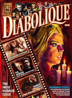
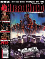
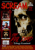
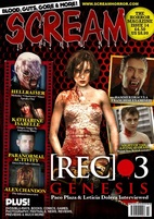
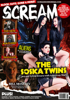
These are the real media texts I got off the internet, which inspired me to make our magazine front covers, I chose these in particular due to the layout, style, lighting the shots the main images are in etc. I will not be copying these entirely but I will use them as a guideline.
|
|
|
|
|
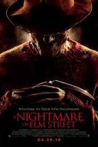
I also had to use existing media texts for the posters I was going to make, these where used to also used to help me as a guideline in making my posters, i used them as inspiration for style, images, lighting, fonts etc.
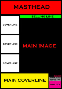
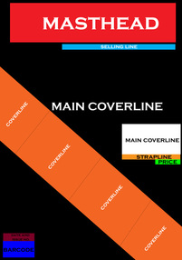
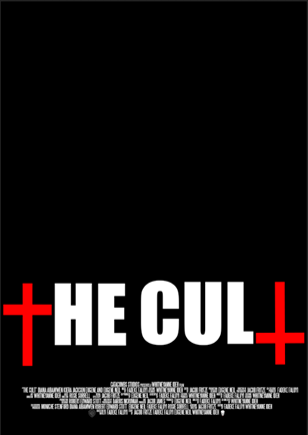
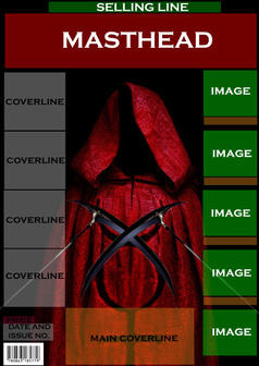
MAGAZINE FRONT COVER HAND DRAWN MOCK-UPS
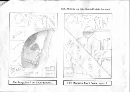
My third magazine idea was inspired by the "Horrorhound" magazine, which has coverlines at the side and the main cover line at the bottom and also the main image in a long shot. The inspiration of this image was actually from Tumblr. I positioned the barcode a the opposite side to the the real media reason being I wanted more space for the cover line in one section. My fourth magazine idea was inspired by the "SCREAM" magazine, featuring "[REC3.]" I did this because the main image was very simple so I could fit in lots of cover lines and images around the magazine, to keep the readers intrigued. 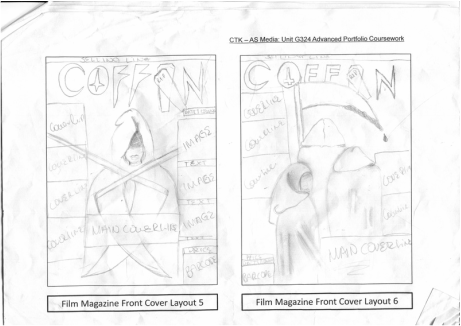
|
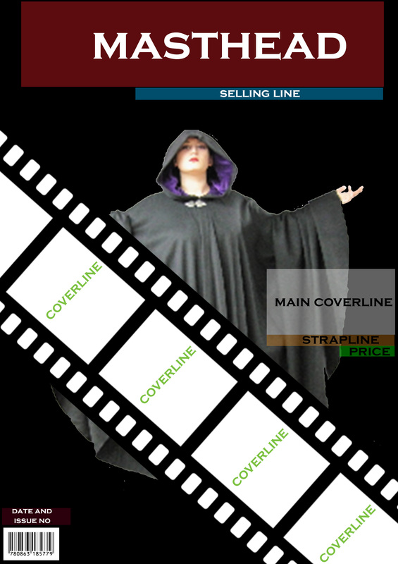
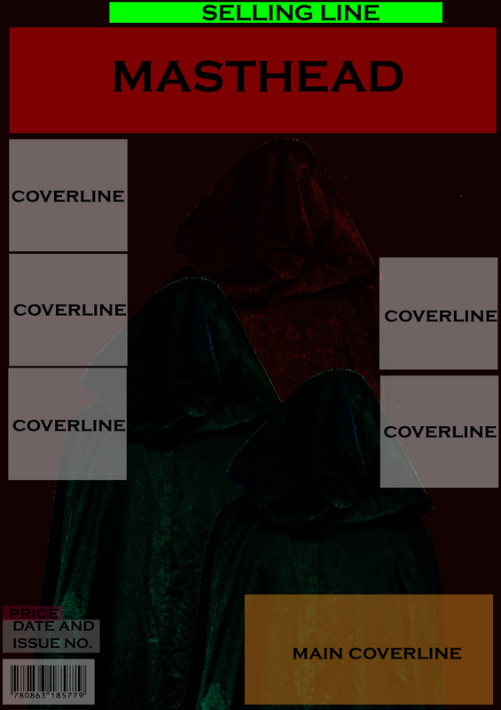
For the first layout my inspiration was taken from the "SCREAM" magazine featuring "The Evil Dead" as the main cover line. The main image was also inspired my "the Evil Dead" that is on the front cover, however what I did differently was that I gave the main image a hood with is inspired from my groups trailer. The second magazine front cover was inspired my "Diabolique". I used the movie strip that runs right across the front cover, this is to make it more interesting and eye-catching. I liked it because it added another visual element to the magazine as well as emphasising that it is part of the "Media" industry. 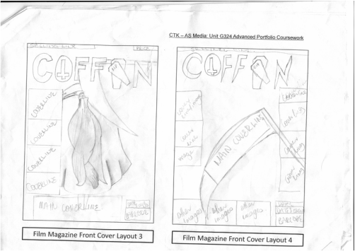
My fifth and sixth magazine front cover mock-up ideas were developed from the "SCREAM" magazine featuring "[REC3]". I did this because the images are in a long/mid shot and I didn't want massive amount of space around the magazine so I spread out the cover lines as seen on the "SCREAM" magazine featuring "[REC3]". I also this this because it will engage the audience more as the get to see what is inside so they can be interested to buy the magazine and read on further. The sixth magazine front cover idea is developed from the "SCREAM" magazine featuring "The Soska Twins". In their front cover they have 3 people as the main image and I found it interesting to use as an idea to utilise for my magazine front cover mock-ups. |
SIMPLE MAGAZINE MOCK-UPS.
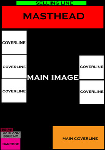
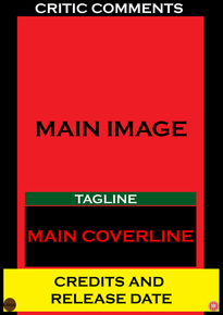
I had to create 4 simple mock-ups on Photoshop to develop 4 of the drawn mock-ups I had done. This is essentially used as a guideline to see where everything should be placed. At this stage I developed my first, second, fifth and sixth ideas as they were essentially my favourites.
|
|
|
|
MAGAZINE DEVELOPMENT.
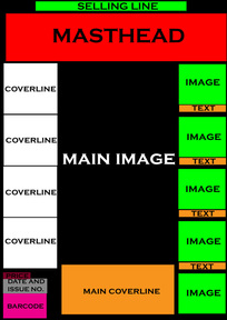
My first Photoshop development is closely inspired by my drawn mock-ups. Using my Photoshop skills I ensured all the boxes were at the right places and were at equal distance not blocking the main image. I followed conventions from a real horror magazine, this is shown through the main image and the lighting connoting fear and death.
|
The second Photoshop development consists of magazine conventions such as cover lines, pricing, dateline, main cover line, bar code and masthead. Using the movie strip across the page made it interesting to read, also makes it eye- catching to the audience.
|

The third Photoshop development was successful because it consists of coverlines as wells as images, this will bring attract the attention of the reader and the main image is made to stand out so it is noticeable to the audience and as well as interesting to read.
|
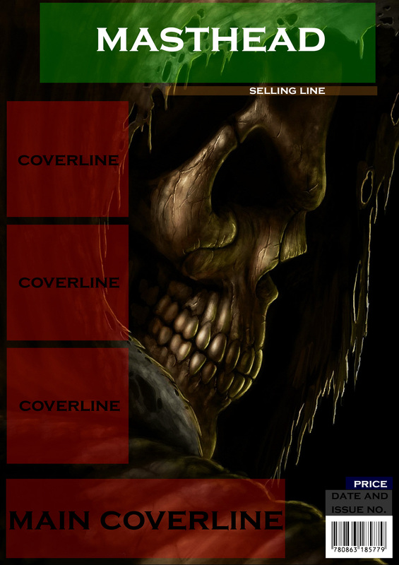
For the fourth Photoshop development I decided to have the main image dark and gloomy, reason being because it really sets the tone of a cult and reinforces the fact that it is still horror magazine you are about to pick up. Similarly to the other Photoshop development, I followed horror magazine conventions and tried to make it look as professional as possible.
|
POSTER HAND DRAWN MOCK-UPS.
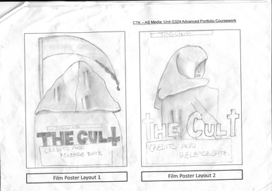
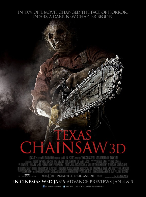
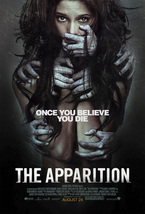
My third poster ideas derived from "The Apparition". I found it interesting because I liked how we get to see the protagonist being victimised, so that would raise a lot of question for the audience who would wonder why she is being victimised and by whom. I really like the fact that the audience can not see who exactly is victimising the main character, but all we can see are the hands doing damage. My fourth idea takes inspiration from "Texas Chainsaw Massacre". Reason I did this is because the iconic weapon is shown significantly in the poster and that's what I tried to do with this poster. Making the weapon a real eye catcher would really attract the audience. 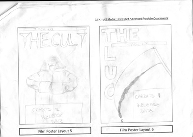
|
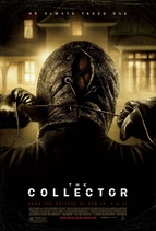
For my first poster idea, my inspiration derived from the film poster of "the Collector". I specifically chose this due to the fact that the antagonist is in the main image facing away from the camera, that makes it interesting to look at. I also included the main iconic weapon with blood dripping to create a better effect. For my second poster idea, I took inspiration from just looking through the internet as I needed images that went with the cult idea we have in mind. I used similar ideas from the collector, but tweaked it by using the protagonist, instead of the antagonist, and instead of having the main image's back to the camera, I made sure the main image was slightly looking at the camera, so that the audience know it's most likely not an antagonist. 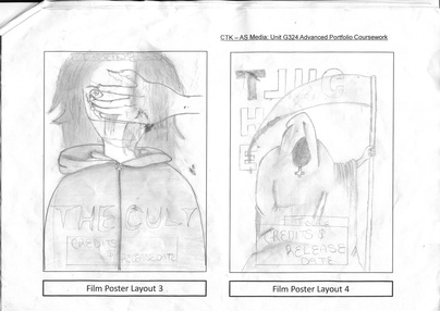
My fifth poster, didn't really take inspiration from much, but I did get some help from "A Nightmare On Elm Street". I did this because I love the way his hands are positioned ready to apprehend someone to kill. This is what I tried to do with this poster, but I also had to try and make it relate to the cult as much as possible.
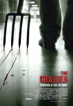
My sixth poster was inspired by the film "The Crazies". I used this poster as inspiration because the main image consists of just an iconic weapon used in the movie, and you can tell it's the murder weapon due to the blood slithering on the floor. That is what i did with my poster as I wanted the weapon full of blood of it's victims so the audience recognise it through the trailer. |
SIMPLE POSTER MOCK-UPS.
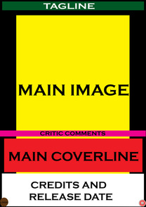
I had to create 4 simple mock-ups on Photoshop to develop 4 of the drawn mock-ups I had done. This is essentially used as a guideline to see where everything should be placed. At this stage I developed my first, second, forth and sixth ideas, as they were essentially my favourites. I later on I changed my sixth idea, and instead did my fifth idea.
|
|
|
|
POSTER DEVELOPMENT.

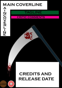
My first Photoshop development is exactly how my drawn draft is, reason being it;s an idea that I found, work really well. I used a stainless steel background and changed the colour level to red using Photoshop, so that it gives that feeling of death. The hardest part was having to add a weapon into the shot as the main image and the weapon are from different pictures on the internet. I also follow conventions like where the 'credits and release dates' are placed, the 'tagline' and also the 'critic'.
|
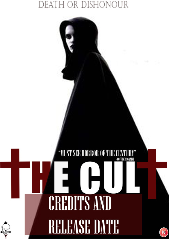
My second Photoshop development is very similar to my drawn mock-up I initially did. The main difference is that the main image's face is seen, this connotes that she is probably running away from something scared and worried. What I also changed was the way the 'T's in the masthead look. They look more like crosses, emphasizing the name of the film. This poster is successful as it uses convention from real media text such as 'masthead' 'critic' and a 'logo and age certificate'.
|
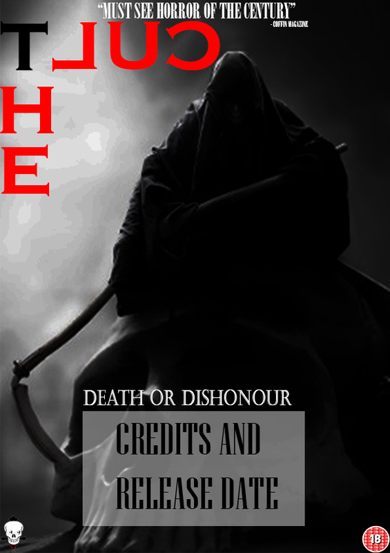
In my third Photoshop development, what I decided to change that was different to the drawn mock-ups was the was the way the weapon was held. Reason being was because I find it that regardless of the way the weapon is being held, it still connotes fear and death. I put the wording of the masthead backwards because I believe it'll be more effective as it will attract more people to read it.
|
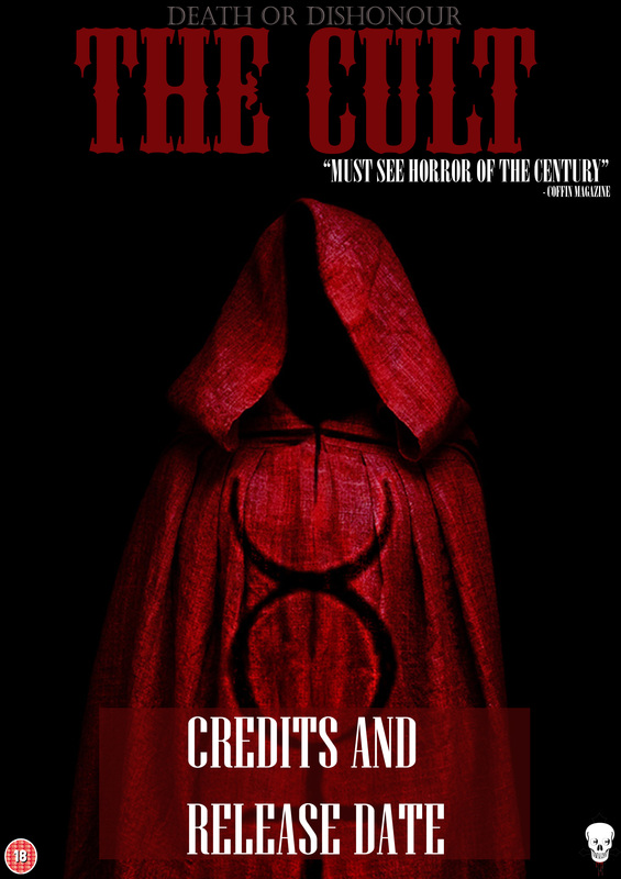
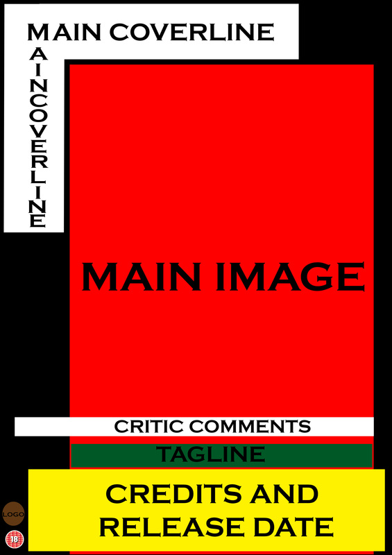
In my fourth Photoshop development poster I decided to go with my 5th drawn mock-up rather than my 6th, reason being I found the 6th relatively challenging to do, I preferred the 5th. what I found that was successful was the main image. The main image does not really correlate with the image I drew in the drawn mock-ups but I believe this is much stronger. "The simpler the better".I also put the masthead, tagline and the critic comments above the main image so your attention is drawn to the main image rather than everything else, this is very effective as it will attract my target audience more and get them more intrigued to watching the trailer.
|
TEST SHOTS FOR MAGAZINE AND POSTER.
|
|
For this section we had to test pictures for what our magazine and poster front page could possibly look like. We were giving the chance to play with the light and to see which lighting worked well with the different kinds of shots. These photos where not to be used on our actual magazine and poster, there were to give us a mere feel of what we could do.
These shots are clearly amateur shots, we didn't know what we were doing when taking these photographs. At this point we didn't have any costume and make-up to use to make the shots look better than they did. Also the lighting at certain points where very low and we couldn't see Jacob at all, even though the shots where in focus. We focused more on close-ups rather than mid-shots and long-shots and we didn't really explore any angles as we just went with what felt right at the time, rather than what looked good and what would look suitable. |
MAGAZINE AND POSTER STAGES.
Here we had to use Photoshop to show how our poster and magazine would look like, mainly to have a feel of what we should expect.
POSTER STAGES...
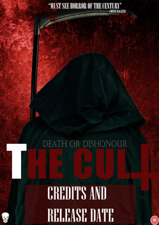
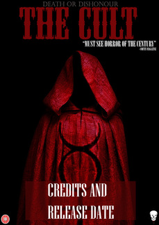
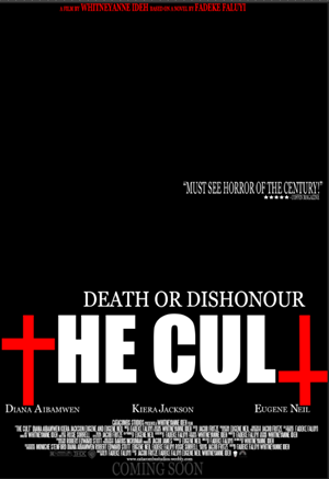
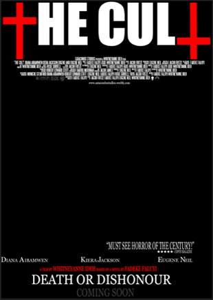
These are the posters I decided to pick some ideas from. I had previously made these posters adapting from my drawn drafts.
|
|
|
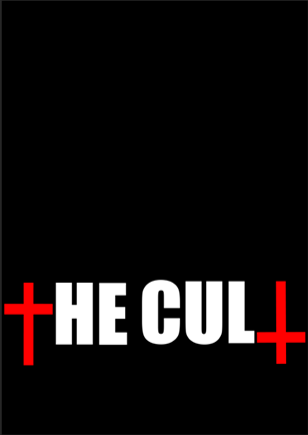
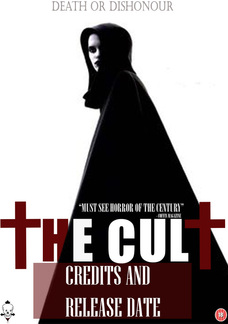
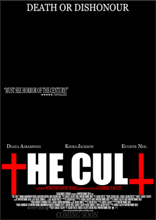
Firstly I used a black background because I ideally would prefer a dark background or red. Then I had to place the mast head, the font I used is called "Impact" and the crosses were made using the rectangle tool.
|
Next I used a font called "Steel tongs" to write up the credits which were fairly easy to do.
at this stage I had some logos added to the poster, such as the distributing company and my company.
|
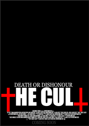
Then I added the tagline that I and myself and my group decided on. "Death or Dishonour". I did this in white so that and made sure it was directly above the masthead so that as people see the masthead they will also notice the tagline and hopefully get them more intrigued.
|
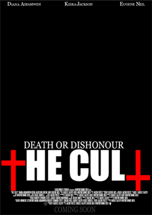
I then added the name of the main cast in the movie at the top of the poster, which is what other real movie posters do in order to promote their movies. They tent to consist of the names of the star powers in the movie, in order to attract a wider audience.

|
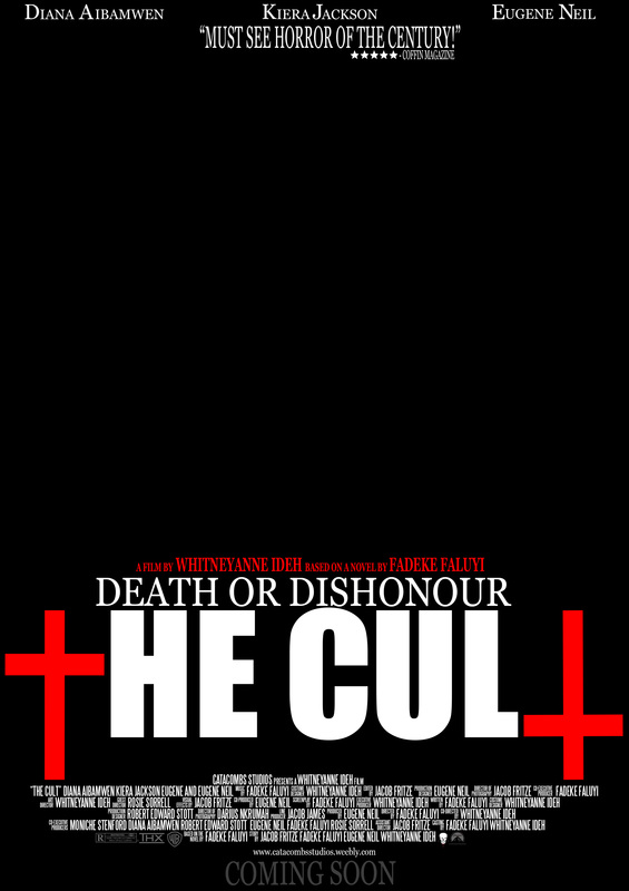
This is what my drafting poster looked like when I had finished. I added a critic review at the top with the names quoting "Must see horror of the century! - Coffin Magazine" and this is something that are on real movie posters so I having that on there would make my magazine look more realistic.
As I tend to see pull quotes on movie posters so having one would make my poster more realistic as it is a common convention. 
in addition to this I added some logos and an age certificate, website and a 'coming soon'.
|
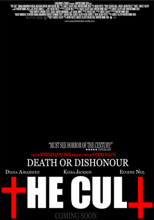
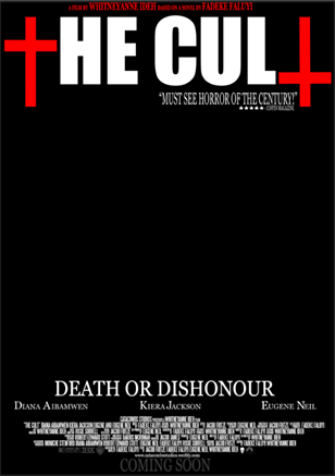
I decided to explore different ways my magazine could look, even though I did go against common conventions by putting the steel tongs font at the top, I was trying to see if it would look good, looking completely different from the others.
|
MAGAZINE STAGES...
These are the magazines I decided to pick some ideas from. I had previously made these posters adapting from my drawn drafts.

|
|
|
Firstly I wanted my magazine to look dark but not way too dark so I used a dark grey background to achieve what I was mainly anticipating for. We decided to call our magazine "Coffin" and I used an actual coffin with an upside down cross to make the "O".
|
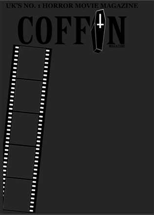
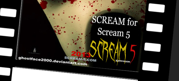
Next I added a movie strip at the side, just so it represents a movie magazine, so it doesn't look more like a costume magazine or so. I got his idea from a magazine called "Scream" and I thought it would be really cool to have a film on my magazine.
|
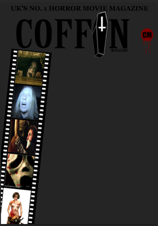
Then I added images from various horror movies in the movie strip such as "Evil Dead", "Paranormal Activity", "Texas Chainsaw", "Scream5" and "REC3". I also made a quick logo, however I will be making a better one for my final product.
|
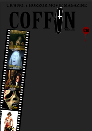
I then added some coverlines to the images at the side just to give the audience a general idea as to what to expect in the magazine and generally why the images are actually there in the first place.
|
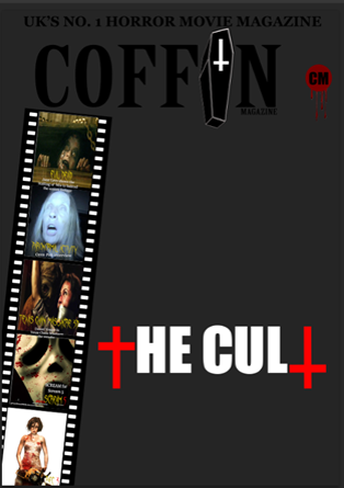
I added the main cover-line which was the name of my movie, this shows people that the main story ids based around "The Cult".
|
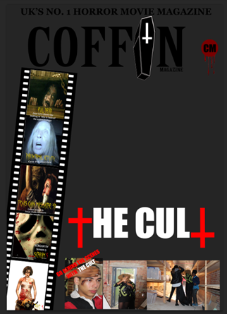
I added pictures of my group behind the scenes, which would probably be free posters inside the magazine, engaging the audience more.
|
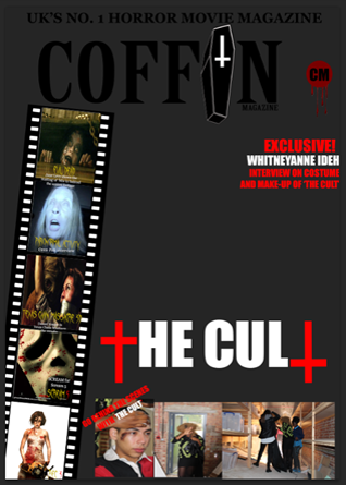
I added a cover-line without pictures which featured an exclusive interview with the costume and make-up personnel - Whitneyanne Ideh.
|
I got to add my favourite convention, which is the plus sign '+' I prefer it much better than having "PLUS" at the side as I do not find it appealing.
|
|
|
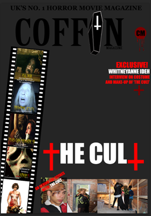
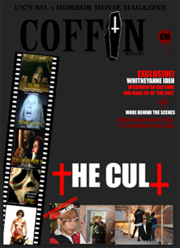
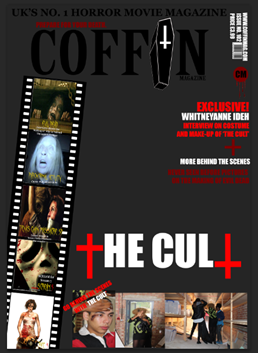
After adding another cover-line to the page so that it doesn't look really hollow which featured behind the scenes pictures of "Evil Dead", I will change this as I already have "Evil Dead" featured at the front of my magazine already. I then added my teams website, issue number, a price tag and a barcode which are very relevant conventions as the audience need to know how much they are buying the magazine for.
FINAL PHOTOGRAPHY...
Here are the pictures that we will be considering to use for the final magazine and poster. Enjoy!
